Creating a generic Module Center module
At some point your module might need some kind of configuration page for your module. Using the GXModule.json file
in the root directory of your module, you can define an automatically created configurations page that can be accessed
by our Module Center.
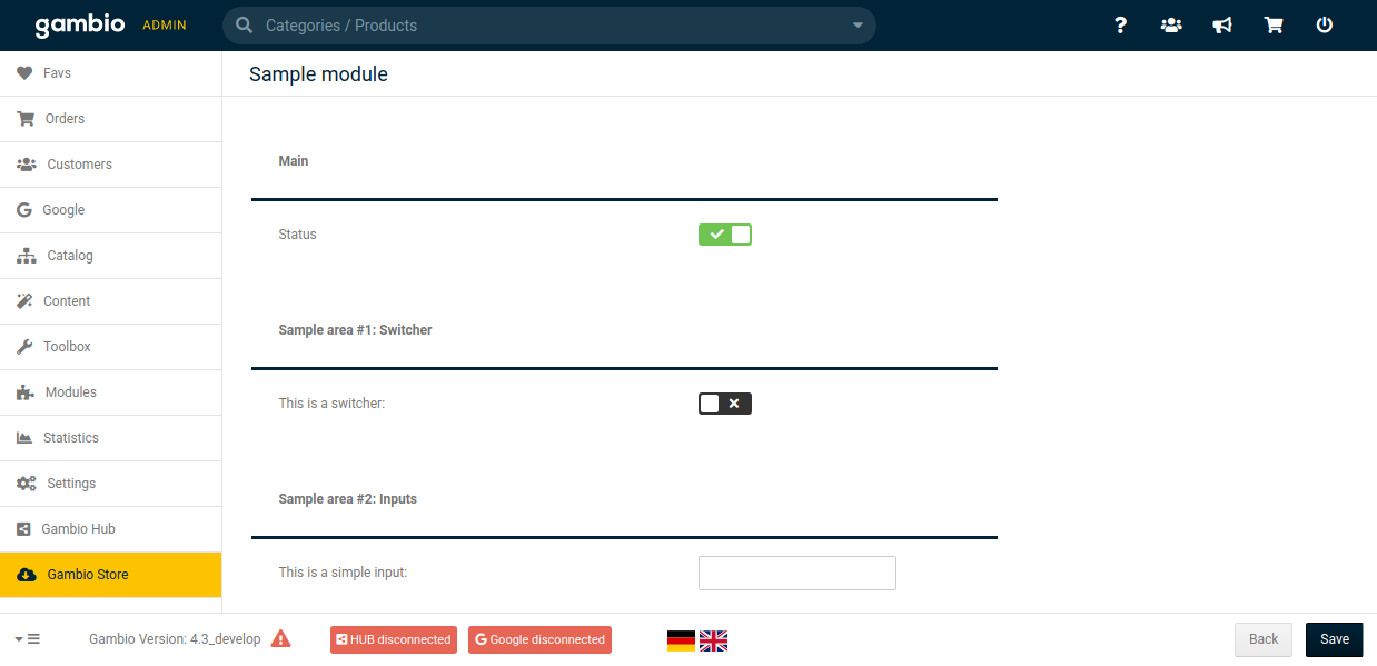
If you take a closer look at the following example configuration page, you can see that there are multiple sections that include several configurations, which have specific types and parameters.
Defining sections
To start with everything is based on the JSON structure of the GXModule.json file, with the configuration attribute.
{
    "title": "sample_module.module_title",
    "description": "sample_module.module_description",
    "forceIncludingFiles": false,
    "configuration": [
        {
            "title": "sample_module.section_title",
            "fields": {}
        }
    ]
}
Each JSON object inside the configuration array defines a section of the configuration page. Similar to the
title attribute, each of these JSON object inside the configuration array reference their title the
same way. Using the fields object you can define the specific configurations that belong to this section. More
information about defining configurations will be given in the next part.
Besides these two attributes, there is also another optional attribute called tab that references a text phrase
(like the title and description attributes). If you add this attribute, a tab will be added to the
configuration page and this tab will only contain the sections with the same reference.
{
    "title": "sample_module.module_title",
    "description": "sample_module.module_description",
    "forceIncludingFiles": false,
    "configuration": [
        {
            "title": "sample_module.section_title_1",
            "tab": "sample_module.tab_title_1",
            "fields": {}
        },
        {
            "title": "sample_module.section_title_2",
            "tab": "sample_module.tab_title_1",
            "fields": {}
        },
        {
            "title": "sample_module.section_title_3",
            "tab": "sample_module.tab_title_2",
            "fields": {}
        },
        {
            "title": "sample_module.section_title_4",
            "fields": {}
        }
    ]
}
If some sections do have a tab attribute and some don't, then all sections without this attribute will be grouped
by a General (or in German Allgemein) tab.
Defining configurations
Configurations itself can be defined by using the fields attribute inside the JSON object for describing the sections.
Therefore, you have two possibilities to select one of many configuration types and use parameters to change this
configuration regarding your needs. Defining a configuration named sampleConfig, a simple input value, looks like this:
{
    "title": "sample_module.module_title",
    "description": "sample_module.module_description",
    "forceIncludingFiles": false,
    "configuration": [
        {
            "title": "sample_module.section_title",
            "fields": {
                "sampleConfig": {
                    "type": "text",
                    "label": "sample_module.input_field"
                }
            }
        }
    ]
}
The type attribute defines the type of the configuration and label references a text phrase. The key sampleConfig
is used for identifying, storing and reading the configuration and its given value. How to get a specific configuration
value will be explained in the chapter [Reading configuration values].
The following part lists the available types, provides examples how to define them and lists all (optional) parameters that can be used to modify the configuration.
Configuration types
Switcher

{
    "configuration": [
        {
            "title": "sample_module.section_switcher",
            "fields": {
                "sampleSwitcher": {
                    "type": "checkbox",
                    "label": "sample_module.label_switcher"
                }
            }
        }
    ]
}
default_valuerequiredtooltip
Simple input field

{
    "configuration": [
        {
            "title": "sample_module.section_inputs",
            "fields": {
                "sampleInput": {
                    "type": "text",
                    "label": "sample_module.label_input"
                }
            }
        }
    ]
}
default_valuereadonlyregexrequiredtooltip
Password input field

{
    "configuration": [
        {
            "title": "sample_module.section_inputs",
            "fields": {
                "samplePassword": {
                    "type": "password",
                    "label": "sample_module.label_password"
                }
            }
        }
    ]
}
regexrequiredtooltip
Email input field

{
    "configuration": [
        {
            "title": "sample_module.section_inputs",
            "fields": {
                "sampleEmail": {
                    "type": "email",
                    "label": "sample_module.label_email"
                }
            }
        }
    ]
}
default_valuereadonlyregexrequiredtooltip
Numeric input field

{
    "configuration": [
        {
            "title": "sample_module.section_inputs",
            "fields": {
                "sampleNumber": {
                    "type": "number",
                    "label": "sample_module.label_number"
                }
            }
        }
    ]
}
default_valuemaxminreadonlyregexrequiredsteptooltip
Color picker

{
    "configuration": [
        {
            "title": "sample_module.section_inputs",
            "fields": {
                "sampleColor": {
                    "type": "color",
                    "label": "sample_module.label_color"
                }
            }
        }
    ]
}
default_valuerequiredtooltip
Date picker

{
    "configuration": [
        {
            "title": "sample_module.section_inputs",
            "fields": {
                "sampleDate": {
                    "type": "date",
                    "label": "sample_module.label_date"
                }
            }
        }
    ]
}
default_valuereadonlyrequiredtooltip
Date and time picker

{
    "configuration": [
        {
            "title": "sample_module.section_inputs",
            "fields": {
                "sampleDateTime": {
                    "type": "datetime",
                    "label": "sample_module.label_datetime"
                }
            }
        }
    ]
}
default_valuereadonlyrequiredtooltip
File update

{
    "configuration": [
        {
            "title": "sample_module.section_inputs",
            "fields": {
                "sampleFile": {
                    "type": "file",
                    "label": "sample_module.label_file",
                    "folder": "images"
                }
            }
        }
    ]
}
Necessary parameters:
folder: Destination directory for the updated file, based on the root directory of the shop.
accepttooltip
Textarea
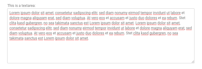
{
    "configuration": [
        {
            "title": "sample_module.section_inputs",
            "fields": {
                "sampleTextarea": {
                    "type": "textarea",
                    "label": "sample_module.label_textarea"
                }
            }
        }
    ]
}
default_valuereadonlyrequiredtooltip
HTML Editor
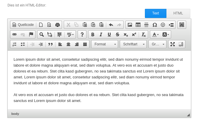
{
    "configuration": [
        {
            "title": "sample_module.section_inputs",
            "fields": {
                "sampleEditor": {
                    "type": "editor",
                    "label": "sample_module.label_editor"
                }
            }
        }
    ]
}
default_valuereadonlyrequiredtooltip
Dropdown
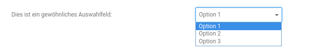
{
    "configuration": [
        {
            "title": "sample_module.section_selects",
            "fields": {
                "sampleSelect": {
                    "type": "select",
                    "label": "sample_module.label_select",
                    "values": [
                        {
                            "value": "value1",
                            "text": "sample_module.option_value1"
                        },
                        {
                            "value": "value2",
                            "text": "sample_module.option_value2"
                        },
                        {
                            "value": "value2",
                            "text": "sample_module.option_value3"
                        }
                    ]
                }
            }
        }
    ]
}
Necessary parameters:
values: Contains a list of all available items. Thevalueattribute defines the value of the item and thetextattribute references a text phrase.
default_valuerequiredtooltip
Dropdown with multi select
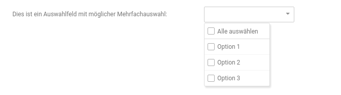
{
    "configuration": [
        {
            "title": "sample_module.section_selects",
            "fields": {
                "sampleMultiSelect": {
                    "type": "multiselect",
                    "label": "sample_module.label_multiselect",
                    "values": [
                        {
                            "value": "value1",
                            "text": "sample_module.option_value1"
                        },
                        {
                            "value": "value2",
                            "text": "sample_module.option_value2"
                        },
                        {
                            "value": "value2",
                            "text": "sample_module.option_value3"
                        }
                    ]
                }
            }
        }
    ]
}
Necessary parameters:
values: Contains a list of all available items. Thevalueattribute defines the value of the item and thetextattribute references a text phrase.
default_valueselectedrequiredtooltip
Customer groups
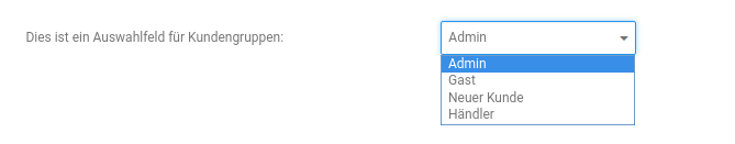
{
    "configuration": [
        {
            "title": "sample_module.section_selects",
            "fields": {
                "sampleCustomerGroup": {
                    "type": "customer_group",
                    "label": "sample_module.label_customer_group"
                }
            }
        }
    ]
}
default_valuerequiredtooltip
Order status
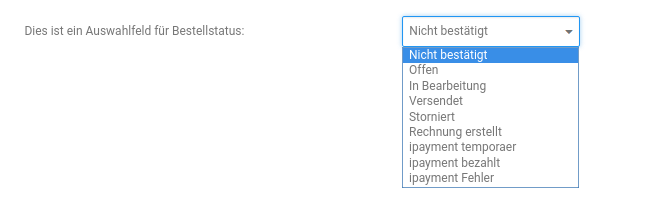
{
    "configuration": [
        {
            "title": "sample_module.section_selects",
            "fields": {
                "sampleOrderStatus": {
                    "type": "order_status",
                    "label": "sample_module.label_order_status"
                }
            }
        }
    ]
}
default_valuerequiredtooltip
Countries
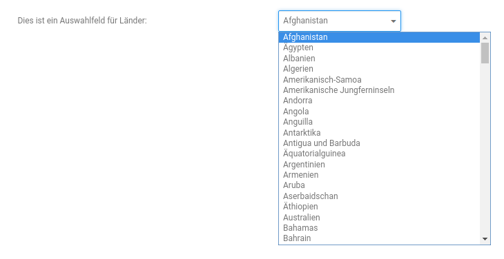
{
    "configuration": [
        {
            "title": "sample_module.section_selects",
            "fields": {
                "sampleCountryList": {
                    "type": "countries",
                    "label": "sample_module.label_countries"
                }
            }
        }
    ]
}
default_valuerequiredtooltip
Languages

{
    "configuration": [
        {
            "title": "sample_module.section_selects",
            "fields": {
                "sampleLanguage": {
                    "type": "languages",
                    "label": "sample_module.label_languages"
                }
            }
        }
    ]
}
default_valuerequiredtooltip
AJAX button

{
    "configuration": [
        {
            "title": "sample_module.section_buttons",
            "fields": {
                "sampleAjaxButton": {
                    "type": "button",
                    "label": "sample_module.label_button_ajax",
                    "text": "sample_module.text_button_ajax",
                    "action": {
                        "controller": "SampleButtonController",
                        "method": "sampleAction",
                        "message": "sample_module.text_success_button_ajax"
                    }
                }
            }
        }
    ]
}
Necessary parameters:
action: Defines the AJAX action that's triggered after clicking the button.controller: Defines the controller class that is to be called.method: Defines the method of the controller class that is to be called.message: References the text phrase for the success message that is to be be shown.
colortooltip
Notice: The first provided argument to the called controller method contains all form data of the configuration
page. For an easier handling, you can extend from the \GXModuleController class.
Modal button

{
    "configuration": [
        {
            "title": "sample_module.section_buttons",
            "fields": {
                "sampleModalButton": {
                    "type": "button",
                    "label": "sample_module.label_button_modal",
                    "text": "sample_module.text_button_modal",
                    "modal": "sampleModal"
                }
            }
        }
    ]
}
Necessary parameters:
text: References the text phrase that is to be used as the modal text.modal: Defines which modal is to be shown.
colortooltip
Modal with simple text
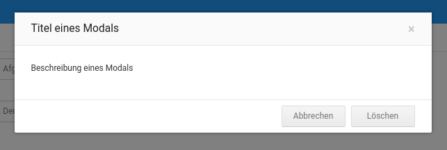
{
    "configuration": [
        {
            "title": "sample_module.section_buttons",
            "fields": {
                "sampleModal": {
                    "type": "modal",
                    "title": "sample_module.modal_title_sample_modal",
                    "description": "sample_module.modal_description_sample_modal",
                    "buttons": {
                        "close": {
                            "text": "buttons.cancel"
                        },
                        "delete": {
                            "text": "buttons.delete",
                            "action": {
                                "controller": "SampleButtonController",
                                "method": "someAction",
                                "message": "sample_module.text_success_button_modal"
                            }
                        }
                    }
                }
            }
        }
    ]
}
Necessary parameters:
title: References the text phrase that is to be used as the modal title.description: References the text phrase that is to be used as the modal text.buttons: Defines the available buttons.close,delete: Name of the available buttons.action: (Optional) Defines the AJAX action that's triggered after clicking the button. If this attribute is missing, the modal will be closed after clicking the button.controller: (Optional) Defines the controller class that is to be called.method: (Optional) Defines the method of the controller class that is to be called.message: (Optional) References the text phrase for the success message that is to be shown.
color
Modal with rendered HTML
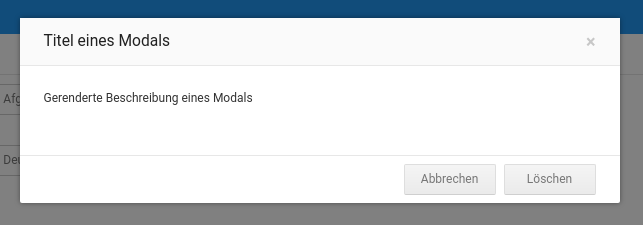
{
    "configuration": [
        {
            "title": "sample_module.section_buttons",
            "fields": {
                "sampleModal2": {
                    "type": "modal",
                    "title": "sample_module.modal_title_sample_modal",
                    "content": "Vendor/Module/Admin/Html/modal_content.html",
                    "buttons": {
                        "close": {
                            "text": "buttons.cancel"
                        },
                        "delete": {
                            "text": "buttons.delete",
                            "action": {
                                "controller": "SampleButtonController",
                                "method": "someAction",
                                "message": "sample_module.text_success_button_modal"
                            }
                        }
                    }
                }
            }
        }
    ]
}
Necessary parameters:
content: References the HTML file that is to be rendered.buttons: Defines the available buttons.close,delete: Name of the available buttons.action: (Optional) Defines the AJAX action that's triggered after clicking the button. If this attribute is missing, the modal will be closed after clicking the button.controller: (Optional) Defines the controller class that is to be called.method: (Optional) Defines the method of the controller class that is to be called.message: (Optional) References the text phrase for the success message that is to be shown.
color
Optionale parameters
accept
Defines the accepted file extensions for an uploading file.
{
    "configuration": [
        {
            "title": "sample_module.section_optionals",
            "fields": {
                "sampleOptionalAccept": {
                    "type": "file",
                    "label": "sample_module.label_optional_accept",
                    "folder": "images",
                    "accept": "image/*"
                }
            }
        }
    ]
}
color
Defines the color of the button. Possible values are: default, primary, success, info, warning, danger,
and link.
{
    "configuration": [
        {
            "title": "sample_module.section_optionals",
            "fields": {
                "sampleOptionalColor": {
                    "type": "button",
                    "label": "sample_module.label_button_modal",
                    "text": "sample_module.text_button_modal",
                    "modal": "sampleModal",
                    "color": "warning"
                }
            }
        }
    ]
}
default_value
Defines the default value of the configuration.
{
    "configuration": [
        {
            "title": "sample_module.section_optionals",
            "fields": {
                "sampleOptionalDefaultValue": {
                    "type": "text",
                    "label": "sample_module.label_input",
                    "default_value": "Lorem ipsum …"
                }
            }
        }
    ]
}
max
Defines the maximal value of a numeric input field.
{
    "configuration": [
        {
            "title": "sample_module.section_optionals",
            "fields": {
                "sampleOptionalMax": {
                    "type": "number",
                    "label": "sample_module.label_number",
                    "max": 50
                }
            }
        }
    ]
}
min
Defines the minimal value of a numeric input field.
{
    "configuration": [
        {
            "title": "sample_module.section_optionals",
            "fields": {
                "sampleOptionalMix": {
                    "type": "number",
                    "label": "sample_module.label_number",
                    "mix": 50
                }
            }
        }
    ]
}
regex
Defines a pattern for the input value that needs to be matched.
{
    "configuration": [
        {
            "title": "sample_module.section_optionals",
            "fields": {
                "sampleOptionalRegex": {
                    "type": "text",
                    "label": "sample_module.label_input",
                    "regex": "[0-9()-\\+\\s]+"
                }
            }
        }
    ]
}
required
Defines if this input field is required.
{
    "configuration": [
        {
            "title": "sample_module.section_optionals",
            "fields": {
                "sampleOptionalRequired": {
                    "type": "text",
                    "label": "sample_module.label_input",
                    "required": true
                }
            }
        }
    ]
}
selected
Defines the default value for multi select dropdowns (similar to default_value).
{
    "configuration": [
        {
            "title": "sample_module.section_optionals",
            "fields": {
                "sampleOptionalSelected": {
                    "type": "multiselect",
                    "label": "sample_module.label_optional_selected",
                    "values": [
                        {
                            "value": "value1",
                            "text": "sample_module.option_value1"
                        },
                        {
                            "value": "value2",
                            "text": "sample_module.option_value2"
                        },
                        {
                            "value": "value3",
                            "text": "sample_module.option_value3"
                        }
                    ],
                    "selected": [
                        "value1",
                        "value2"
                    ]
                }
            }
        }
    ]
}
step
Defines the steps for a numeric input value.
{
    "configuration": [
        {
            "title": "sample_module.section_optionals",
            "fields": {
                "sampleOptionalStep": {
                    "type": "number",
                    "label": "sample_module.label_optional_step",
                    "step": 0.5
                }
            }
        }
    ]
}
tooltip
Defines a tooltip.
{
    "configuration": [
        {
            "title": "sample_module.section_optionals",
            "fields": {
                "sampleOptionalTooltip": {
                    "type": "text",
                    "label": "sample_module.label_optional_tooltip",
                    "tooltip": {
                        "type": "info",
                        "text": "sample_module.text_tooltip"
                    }
                }
            }
        }
    ]
}
type: Defines the type of the tooltip. Possible values are:infounderror.text: References the text phrase for the tooltip.
Reading a configuration value
To get saved configuration values, you need to use the GXModuleConfigurationStorage. The following example shows,
how to initialize and request a configuration value.
$configurationStorage = MainFactory::create('GXModuleConfigurationStorage', '<Vendor>/<Module>');
$activeValue = $configurationStorage->get('active');
Please mind, that the second argument of the create method uses placeholders for the vendor and module name.
Notice
If no module configuration had been saved, the GXModuleConfigurationStorage will provide the default
configuration value from the GXModule.json.
Type of the return value for each type
| Type | Type of the return value |
|---|---|
checkbox |
string, 1 for true, 0 for false |
text |
string |
password |
string |
email |
string |
number |
string |
color |
string, color code with prefixed # |
date |
string |
datetime |
string |
file |
string, file path based on the root directory of the shop |
textarea |
string, |
editor |
string, |
select |
string |
multiselect |
array |
customer_group |
string |
order_status |
string |
countries |
string |
languages |
string |
Detailed example
We created a detailed example that contains every possible type: