StyleEdit 4 / Themes
Introduction
StyleEdit 4 is an editing tool for the visual customization of themes based on Honeygrid. Themes offer extensive design possibilities.
Theme overview 'My Themes'
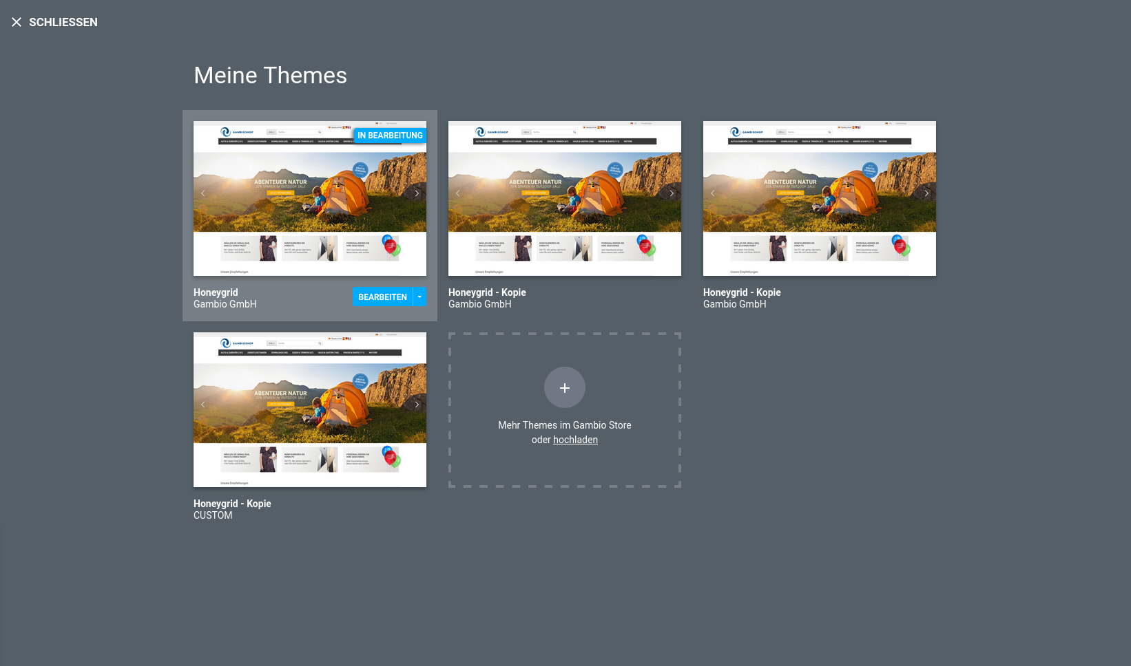
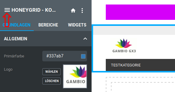
On the My Themes page you will find an overview of all themes created in the shop. The theme overview can be accessed via StyleEdit 4. To do this, click on the icon with the three lines in the upper left corner.
At least one theme is displayed, the Honeygrid theme included in the shop by default. This theme can be edited, but it is not possible to delete it.
Attention
We recommend leaving the original theme unchanged and making all changes within a copy of the original.
Attention
When duplicating a theme, a dependency is created between the original theme and the copy (child theme); the copy refers to the original in order to inherit certain properties from it.
If the original theme is itself a copy, the delete function is not grayed out. If such an original theme (parent theme) is removed, the content that a child theme may refer to may also disappear - this leads to problems with the child theme.
The order of the themes in the overview does not indicate which child theme belongs to which original theme.
We therefore recommend only creating copies of the original in order to avoid unwanted dependencies.
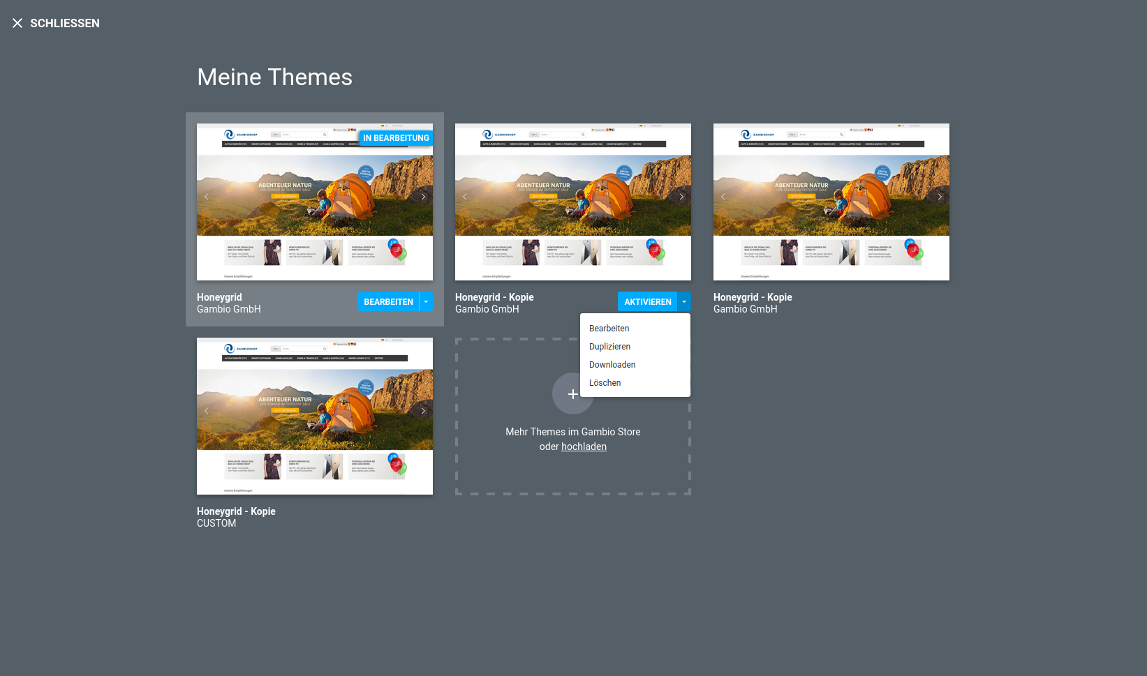
The following actions are available via the dropdown button of a theme:
- Activate
- Edit
- Duplicate
- Download
- Delete
If a theme is activated, it is used in the shop. The shop is therefore visible to the outside world with all the graphic settings that have been made in the active theme.
Clicking on Edit opens StyleEdit 4 and the respective theme can be edited in it.
Opening StyleEdit 4
StyleEdit 4 can be accessed under Content > Edit theme. Click on Edit theme to start StyleEdit 4.
The first call
When called for the first time, only one theme is displayed, the active Honeygrid theme. Active means that changes are directly visible in the shop.
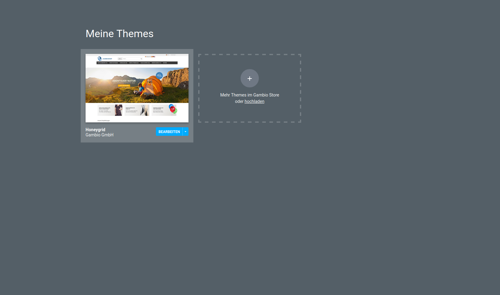
We therefore recommend creating a copy of the theme.
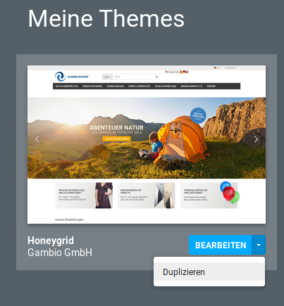
To do this, click on the downward-pointing triangle of the blue button and select the entry Duplicate.
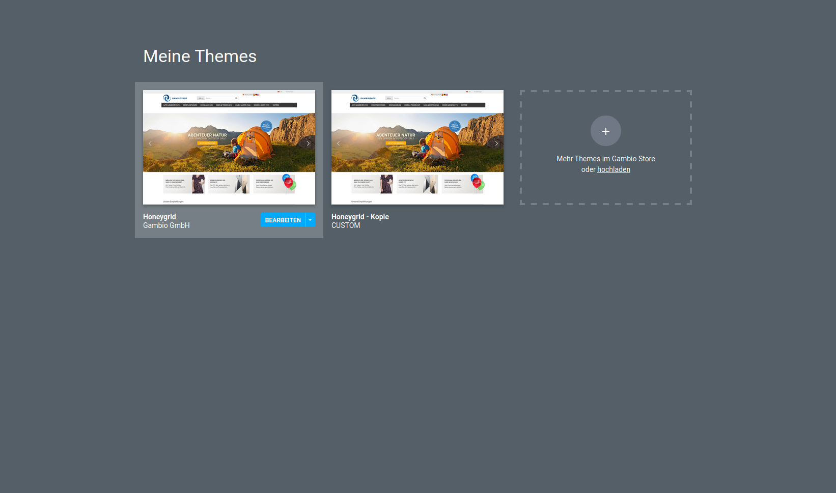
The new theme is displayed with the addition Copy in the name.
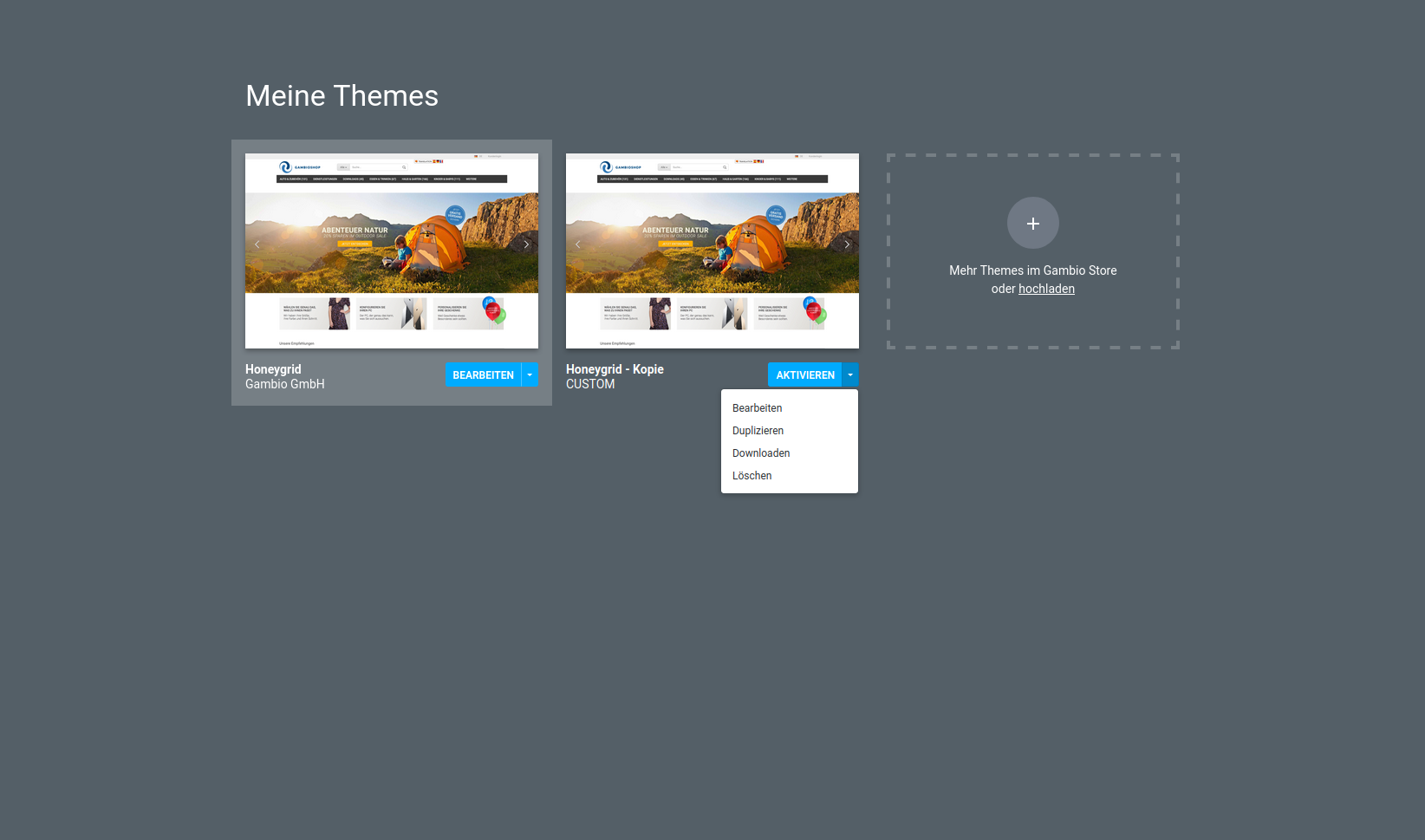
Here, also via the dropdown in the blue button, select the entry Edit. StyleEdit 4 is started and the copy of the active theme is loaded.
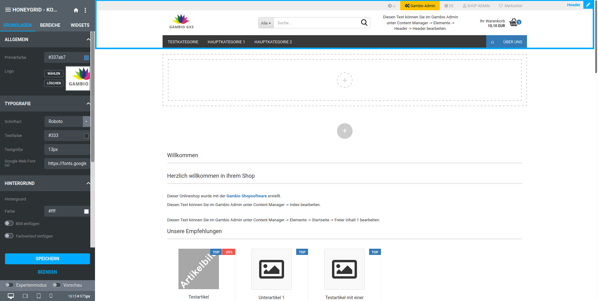
After the first call, clicking on the button Edit theme under Content > Edit theme takes you directly to StyleEdit 4.
From within StyleEdit 4 you can return to the My Themes page if required. To do this, click on the icon with the three lines in the upper left corner or on the theme name displayed next to it. Using the Exit button at the bottom of the StyleEdit you can end the editing mode and return to the shop.
Note
The next time you call it up, you will be taken directly to the StyleEdit, which is loaded with the style Honeygrid Preview. To edit your desired style, click on the name in the title bar of the StyleEdit to return to the My Themes page.
Adopting the settings of another theme
It is possible via StyleEdit 4 to import the settings of another theme into the current theme. To do this, click on the icon in the upper right corner of StyleEdit 4.
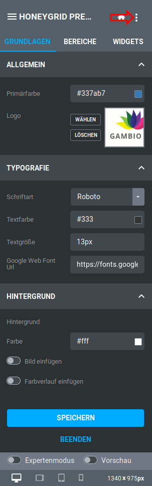
Select the entry Import settings here; a new dialog window opens.
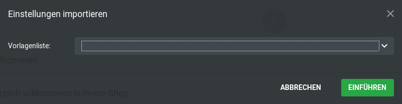
Open the dropdown Template list and select the desired entry.
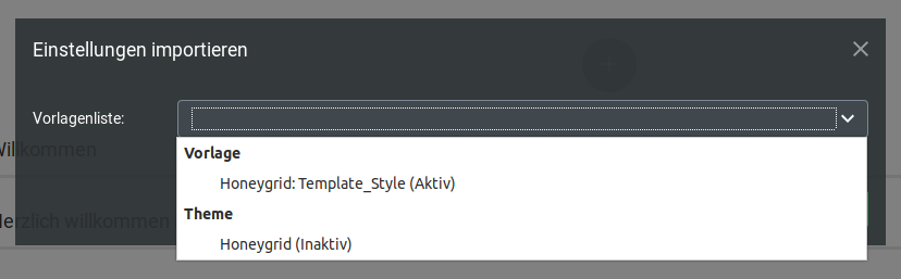
Click on the button Apply to carry out the import.
Structure of StyleEdit 4
The StyleEdit can be divided into four components:
- Title bar
- Menu bar
- Settings area
- lower buttons
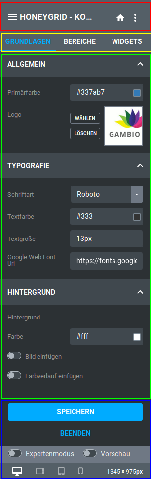
Title bar
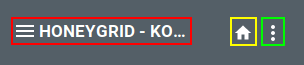
From left to right, the title bar contains the settings
- Theme overview / Theme name: Opens the My Themes page
- Back to the shop start page: Opens the start page of the shop within the StyleEdit
- Additional settings: Edit SCSS/CSS enables the insertion of your own style definitions via SCSS or CSS code. Import settings enables the import of settings from another theme
Menu bar

The different types of settings can be selected via the menu bar. The currently active menu entry is highlighted in blue.
Settings area
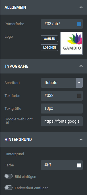
The actual settings are made in the settings area. Depending on which menu entry has been selected, different settings are available.
lower buttons
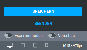
There are various buttons in the lower area:
- Save: saves the changes made in the theme
- Exit: exits StyleEdit 4 so that you return to the shop view
- Expert mode: when activated, more settings are available under Areas
- Preview: activates the preview mode so that the shop is displayed without placeholders for widgets and without highlighting of individual areas
Below this is a bar in which the current size of the displayed shop area is listed and via which its size can be adjusted within the StyleEdit. The display can be switched according to the typical resolution of certain devices:
- Desktop
- Tablet Landscape
- Tablet Portrait
- Smartphone
Editing a theme with StyleEdit 4
Menus of StyleEdit 4
StyleEdit 4 is divided into three menus, across which different types of settings are distributed:
- Basics
- Areas
- Widgets
Basics
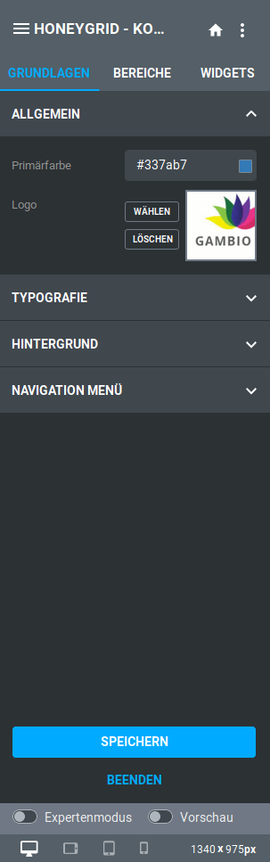
The menu Basics contains the sections General, Typography, Background and Navigation menu. The sections can be expanded and collapsed by clicking on the name.
General
The section General contains the settings Primary color and Logo.
The primary color is used in various places in the shop. These include
- Color of links (without hover)
- Background color of the active category in the vertical category menu in the left column
- Background color of content page entries in the horizontal navigation bar
- Separator >> in the breadcrumb
- The background color of the product count of the small shopping cart
Via the setting Logo it is possible to change the logo on the shop pages. Click on Select or the preview view to select or upload the image file via the file manager. You can find more information on this in the chapter File manager.
The assignment of the logo can be removed via the Delete button.
Typography
In this section, the general font, font color and font size can be defined.
| Field name | Description |
|---|---|
| Font | Here, either select one of the preset fonts via the dropdown or enter the name of the desired font directly into the field next to the dropdown symbol. |
| Text color | Select the desired text color by clicking in the field or preview symbol, or alternatively enter the color code directly. |
| Text size | Enter the font size for general texts in this field. |
Attention
When specifying the font size, a unit must be specified by default. Typically these are pixels, e.g.: 15px
| Field name | Description |
|---|---|
| Google Web Font Url | If Google Web Fonts are used, a URL to the respective font or fonts must be stored. By default, this is the font Roboto with the URL: https://fonts.googleapis.com/css?family=Roboto:400,700,300,900 |
Note
Please note that after saving the Google Web Font Url, the StyleEdit may need to be restarted before the new font can be selected.
Background
Settings for the background can be made here. Either background images or background colors can be set up. For the latter, color gradients can also be configured.
A distinction is made here between the background (of the entire page) and the background of the container (the background of the displayed content in the central area of the page). An example based on a Honeygrid theme in boxed layout:
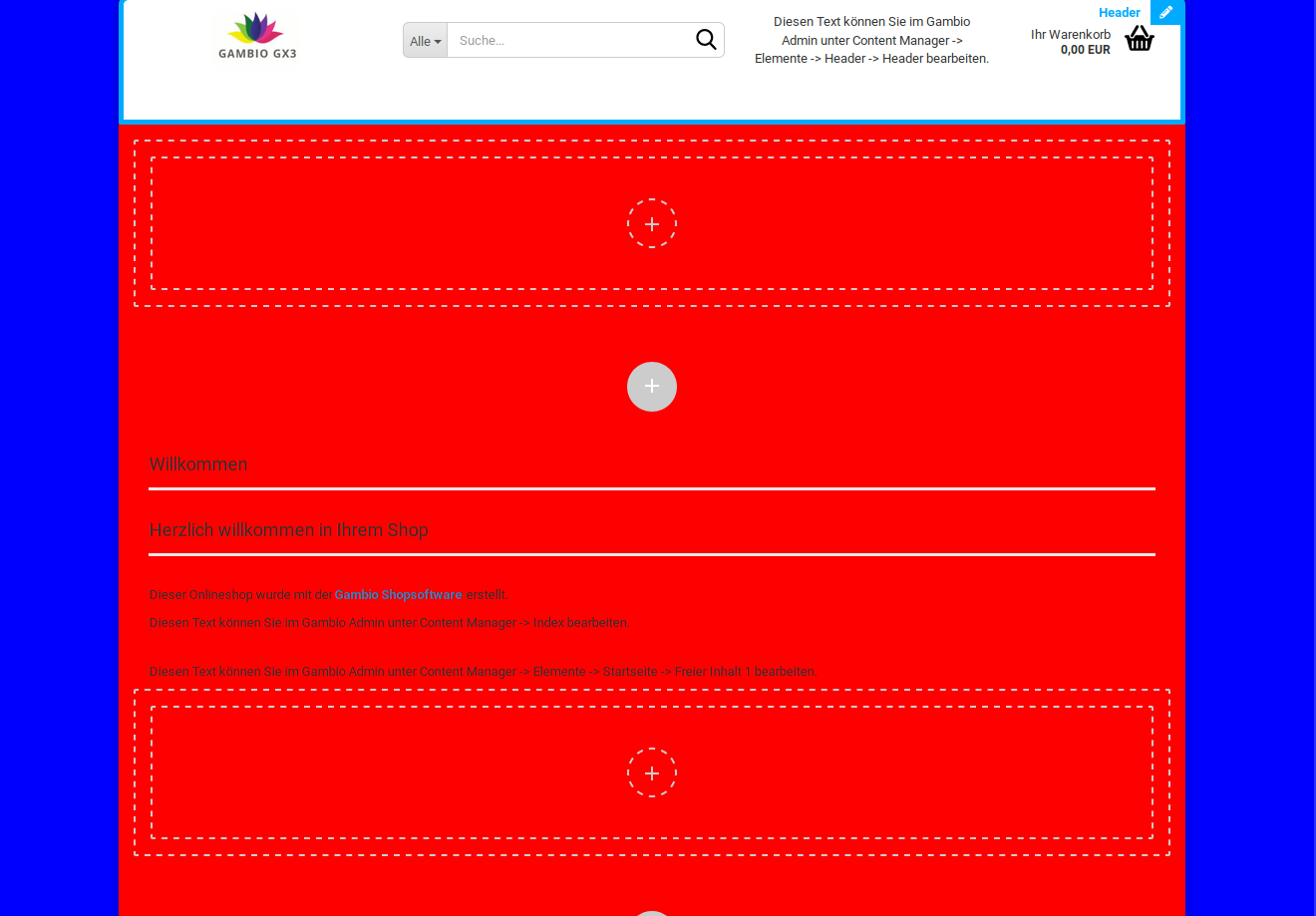
The background color under Background is set to blue, the background color under Background of the container to red.
Navigation menu
In this section, the display of the horizontal menu bar (without dropdown) can be defined. Settings are available for the background color, optionally as a color gradient, the link color or a background image.
Areas
The menu Areas contains settings for the individual areas of the shop.
Note
The settings in this menu depend on the selected mode. To display additional sections, activate the Expert mode in the lower part of the StyleEdit.
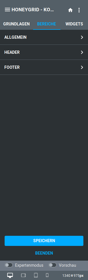
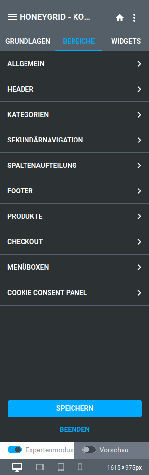
The sections contained are opened with a mouse click. Clicking on the ✖ takes you back to the overview of the areas. Clicking on ← takes you from the subsection back to the parent section
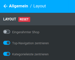
Some sections contain more than one level of subsections.
General
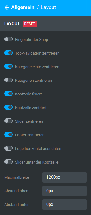
Layout
The following settings are available:
| Field name | Description |
|---|---|
| Boxed shop | displays the shop in a boxed format, the width of the individual areas is reduced to the width of the main area (container). |
Note
If the shop is displayed boxed, the setting Header fixed has no function, since the header, as part of the container, is not fixed.
| Field name | Description |
|---|---|
| Center top navigation | Aligns the secondary navigation bar with the central area (container) |
| Center category bar | Aligns the horizontal navigation bar with the central area (container) |
| Center categories | Aligns the entries in the horizontal navigation bar (categories and content pages) centrally |
| Header fixed | Fixes the header at the top of the window; when scrolling down, the header is displayed in sticky mode (without secondary navigation and horizontal menu) |
| Header centered | Aligns the contents of the header (logo, search, freely designable area, small shopping cart) centrally with the central area (container) |
| Center slider | Aligns the teaser slider with the central area (container) |
| Center footer | Aligns the contents of the footer with the central area (container) |
| Align logo horizontally | Centers the logo in the designated area of the header |
| Slider below the header | moves the slider below the elements of the header |
| Maximum width | Maximum width of the container |
Attention
This value has a significant impact on the display of the Honeygrid on individual devices. It should never be increased and only reduced in exceptional cases
| Field name | Description |
|---|---|
| Spacing top | Spacing above the shop in pixels |
| Spacing bottom | Spacing below the shop in pixels |
Colors
Note
This subsection is only available in expert mode.
Note
Hovering or mouseover refers to placing the mouse pointer over an element without clicking on it
The main color is used in various places in the shop. These include
- Color of links (without hover)
- Background color of the active category in the vertical category menu in the left column
- Background color of content page entries in the horizontal navigation bar
- Separator >> in the breadcrumb
- The background color of the product count of the small shopping cart
| Field name | Description |
|---|---|
| Text color | Select the desired text color by clicking in the field or preview symbol, or alternatively enter the color code directly. |
| Link color | The link color is pre-filled with the main or primary color via the placeholder $brand-primary. If this placeholder is removed, a custom color code can be entered here or selected via the color palette. |
| Breadcrumb color | This can be used to define the link/text color for the breadcrumb. 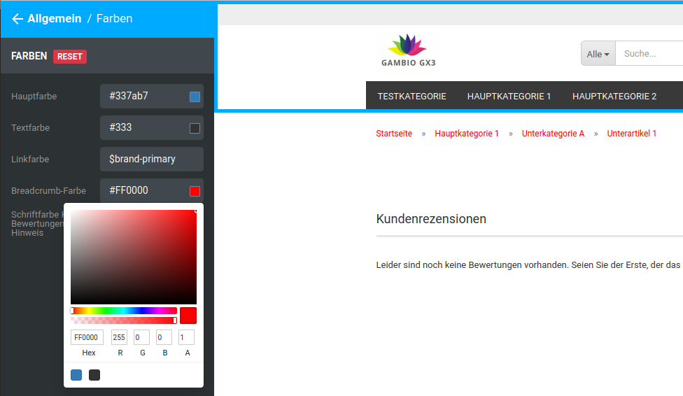 |
Note
The separators >> use the main color
| Field name | Description |
|---|---|
| Font color no reviews notice | Color of the notice Unfortunately there are no reviews yet. Be the first to review the product., which is displayed on the product details page if no customer review has yet been written for the product. By default, the text color is used via the placeholder $text-color. However, this placeholder can be removed if required and replaced with a custom color.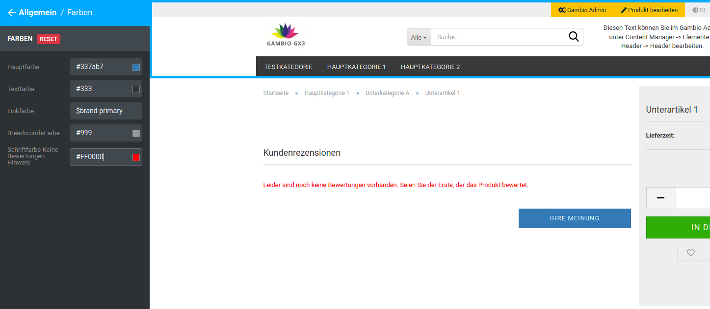 |
Background
Settings for the background can be made here. Either background images or background colors can be set up. For the latter, color gradients can also be configured.
A distinction is made here between the background (of the entire page) and the background of the container (the background of the displayed content in the central area of the page). An example based on a Honeygrid theme in boxed layout:
The background color under Background is set to blue, the background color under Background of the container to red.
Font
The following settings are available:
| Field name | Description |
|---|---|
| Google web fonts url | URL to Google Web Fonts, by default a reference to the font Roboto is stored: https://fonts.googleapis.com/css?family=Roboto:400,700,300,900 |
| Font size | General font size for the texts used in the shop. |
| Font size H1 | Font size for first-order headings, e.g. product name on the product page, category name on the category page, etc. |
| Font size H2 | Font size for second-order headings, e.g. heading Customer reviews on the product page |
| Font size H3 | Font size for third-order headings, e.g. display of the total in the shopping cart |
| Font size H4 | Font size for fourth-order headings |
| Font size H5 | Font size for fifth-order headings |
| Font size H6 | Font size for sixth-order headings |
| Heading color | Font color of the headings, by default assigned the text color via the placeholder $text-color. After removing the placeholder, a custom color can be entered if required. |
| Heading weight | Defines the weight of the headings |
Note
Please note that after saving the Google Web Font Url, the StyleEdit may need to be restarted before the new font can be selected.
Rounded corners
The following settings are available to adjust the radius of the corners used in the Honeygrid:
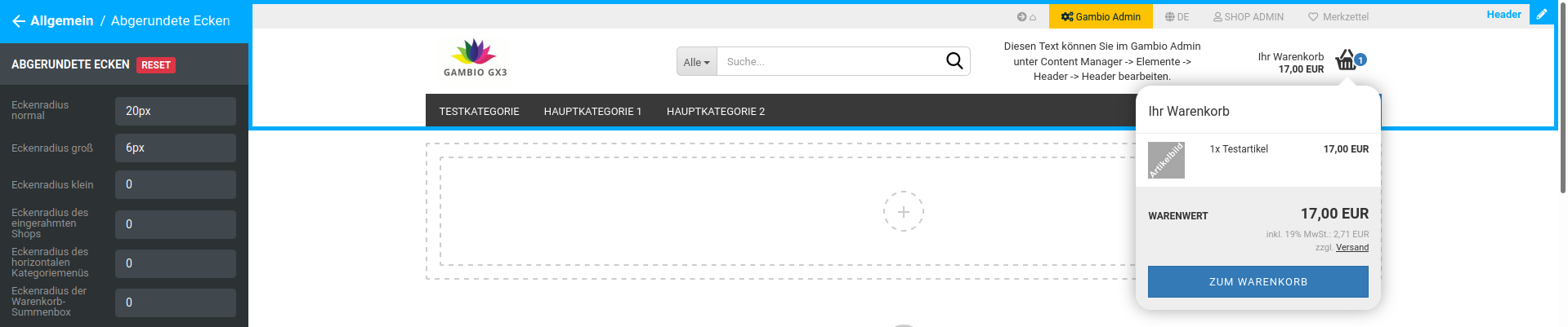
- Corner radius normal, e.g. for the shopping cart dropdown
- Corner radius large, e.g. for the search input field in the header
- Corner radius small
- Corner radius of the boxed shop
- Corner radius of the horizontal category menu
- Corner radius of the shopping cart total box
Teaser slider
Here you can switch on and off whether the teaser slider should be displayed for certain output devices.
Note
The teaser slider images must still be set separately for all output sizes
Page-up button
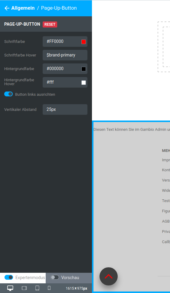
| Field name | Description |
|---|---|
| Font color | Color of the 'up' symbol in the page-up button; by default the main color is stored via the placeholder $brand-primary. If the placeholder is removed, a custom color can be set |
| Font color hover | Color of the 'up' symbol in the page-up button when the mouse pointer is moved over it; by default the main color is stored via the placeholder $brand-primary. If the placeholder is removed, a custom color can be set |
| Background color | Background color of the page-up button |
| Background color hover | Background color of the page-up button when the mouse pointer is moved over it |
| Align button left | Page-up button is displayed in the lower left instead of the lower right corner |
| Vertical spacing | Distance to the lower edge of the browser window |
Note
Hovering or mouseover refers to placing the mouse pointer over an element without clicking on it
Buttons
Note
In the settings, a distinction is made between Primary button, Default button and Buy button.
Primary buttons are e.g. Filter in the filter box, Send in the contact form, Subscribe in the newsletter box, Continue in the checkout process.
Default buttons are e.g. Reset in the filter box, Back on content pages or in the checkout process, Change address in the checkout process, as well as the pagination buttons (tile view, list view, Sort by, ... per page), for instance on category pages.
Buy buttons are the buttons Add to cart and View product.
| Field name | Description |
|---|---|
| Rounded corners | Corner radius of the buttons in the shop, specified together with a unit, e.g.: 10px |
| Text transformation | Changes the capitalization of the button labels |
| none: Text is output as it is stored in the shop (e.g. Content > Customize texts) | |
| uppercase: Text is output in uppercase letters | |
| lowercase: Text is output in lowercase letters | |
| capitalize: Every word begins with a capital letter | |
| Color primary button | Font color for the primary buttons, by default assigned the placeholder $btn-primary-color, can be changed subsequently |
| Background primary button | |
| Color | Background color for the primary buttons, not assigned by default |
| Insert image | Sets a background image for the primary buttons |
| Insert gradient | Sets a color gradient as the background of the primary buttons |
| Border color primary button | Sets the border color of the primary buttons, by default pre-filled with the placeholder $btn-primary-border, can be changed subsequently |
| Color default button | Font color of the default buttons, by default pre-filled with the placeholder $btn-default-color, can be changed subsequently |
| Background default button | |
| Color | Background color for the default buttons, not assigned by default |
| Insert image | Sets a background image for the default buttons |
| Insert gradient | Sets a color gradient as the background of the default buttons |
| Border color default button | Sets the border color of the default buttons, by default pre-filled with the placeholder $btn-default-border, can be changed subsequently |
| Color buy button | Font color of the buy buttons |
| Background buy button | |
| Color | Background color for the buy buttons |
| Insert image | Sets a background image for the buy buttons |
| Insert gradient | Sets a color gradient as the background of the default buttons |
| Border color buy button | Sets the border color of the buy buttons, by default pre-filled with the value darken($gx-btn-calltoaction-bg-color, 5%), can be changed subsequently |
Separator lines
The colors of the various separator lines can be changed here:
- Line color headings
- Border color footer boxes
- Line color headings in checkout
- Border color pagination
- Border color product lists and tiles
- Color of the separator lines product details box
Some of the fields are filled with placeholders; these can be replaced with a custom color specification if required.
Notices
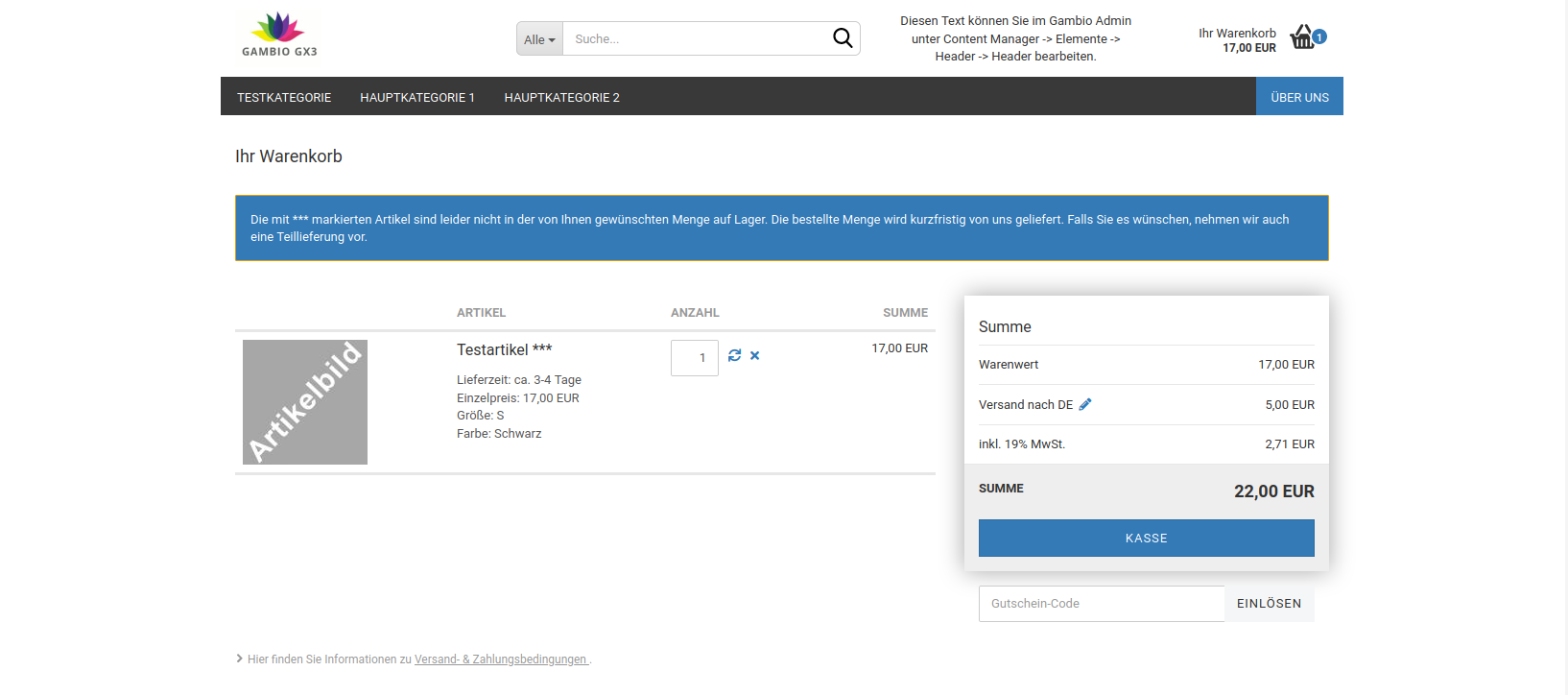
Color-highlighted warnings, error messages, general notices and information are displayed in various places in the shop. In this section, the associated font, border and background colors can be adjusted. If required, images and color gradients can also be set for the backgrounds.
The individual color settings are each filled with placeholders for the default colors, which can be replaced with custom color values if required.
QR codes
In this section, the color and background color of the QR codes used in the shop can be set.
Modal windows
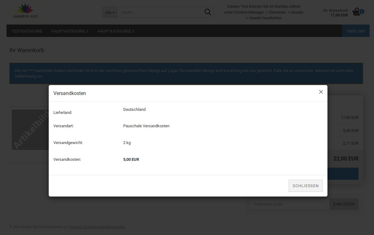
Modal windows are displayed above the actual shop interface and can have various tasks. In this subsection, a background color, a background image or a color gradient can be defined as the background for them.
Header
Variants
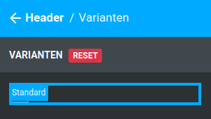
The individual variants of the header can be selected here. In the Honeygrid, the variant Standard is available.
Attention
There are separate height settings for the individual components of the header (logo, search, freely designable area, small shopping cart) as well as for the header itself. These settings must be made uniformly, i.e. if the height of the logo area is increased by 40px from 80px to 120px, the height of the header in the subsection General must also be increased by these 40px, from the default 150px to 190px, otherwise the content will shift.
Standard
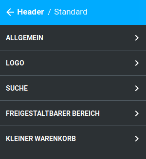
General
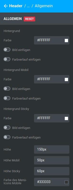
In this subsection, the background of the header (color, color gradient or background image) as well as its height for the various sizes (without size restriction, mobile, sticky) can be defined.
Note
Sticky refers to the reduced form of the header that is used when scrolling down with a fixed header.
| Field name | Description |
|---|---|
| Background | |
| Color | Background color of the header on desktop computers and tablets |
| Insert image | Background image of the header on desktop computers and tablets |
| Insert gradient | Color gradient as the background of the header on desktop computers and tablets |
| Background mobile | |
| Color | Background color of the header on smartphones |
| Insert image | Background image of the header on smartphones |
| Insert gradient | Color gradient as the background of the header on smartphones |
| Background sticky | |
| Color | Background color of the sticky header |
| Insert image | Background image of the sticky header |
| Insert gradient | Color gradient as the background of the sticky header |
| Height | Height of the header on desktop computers and tablets |
| Height mobile | Height of the header on smartphones |
| Height sticky | Height of the sticky header |
| Color of the menu icon mobile | Color of the menu icon on smartphones |
Logo
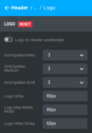
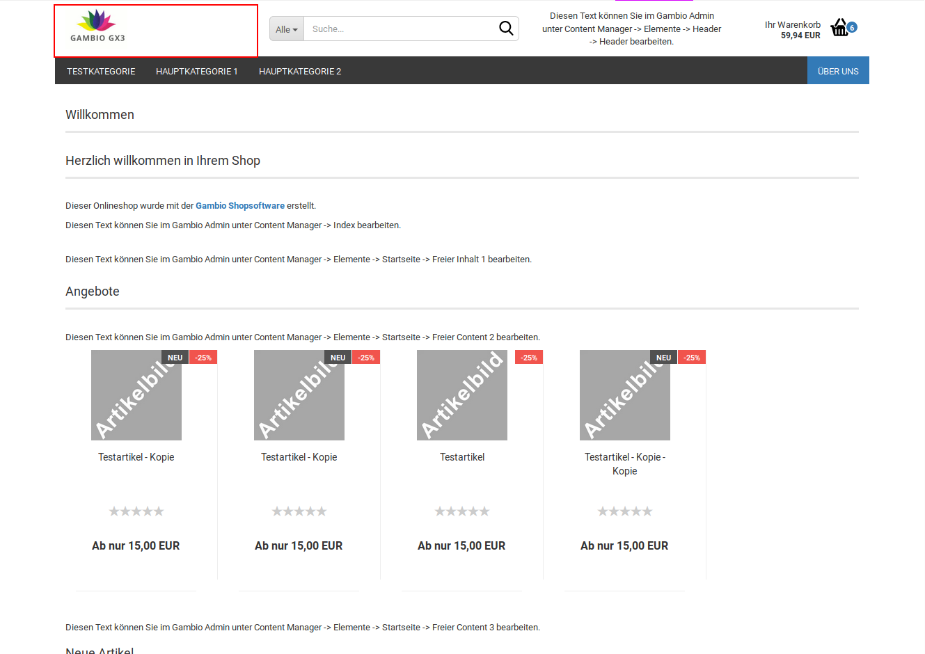
The following settings can be made for the logo:
| Field name | Description |
|---|---|
| Hide logo in header | hides the logo area in the header (reduces the number of grid columns used) |
| Grid columns small | Number of grid columns of the logo area for small display, typically tablet in portrait format |
| Grid columns medium | Number of grid columns of the logo area for medium-sized display, typically tablet in landscape format |
| Grid columns large | Number of grid columns of the logo area for large display, typically desktop computers |
| Logo height | Height of the logo area, specified in pixels by default, e.g. 80px |
| Logo max width mobile | maximum width of the logo area in the smartphone view, specified in pixels by default, e.g. 80px |
| Logo height sticky | Height of the logo area in the sticky header, specified in pixels by default, e.g. 60px |
Note
The graphical interface of the shop is divided across its width into 12 so-called grid columns. There is a separate setting for each size (large, medium, small). The sum of all settings of a size that are not hidden must equal 12. Further information on this is provided in the chapter Grid columns.
Note
Sticky refers to the reduced form of the header that is used when scrolling down with a fixed header.
Search
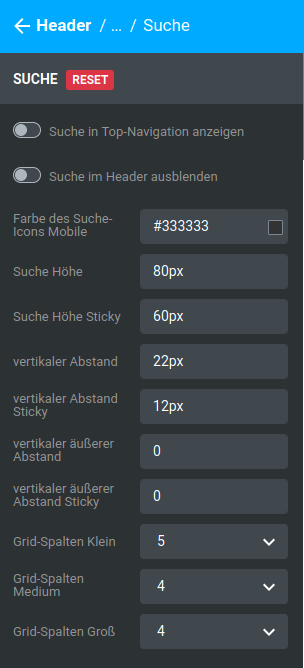
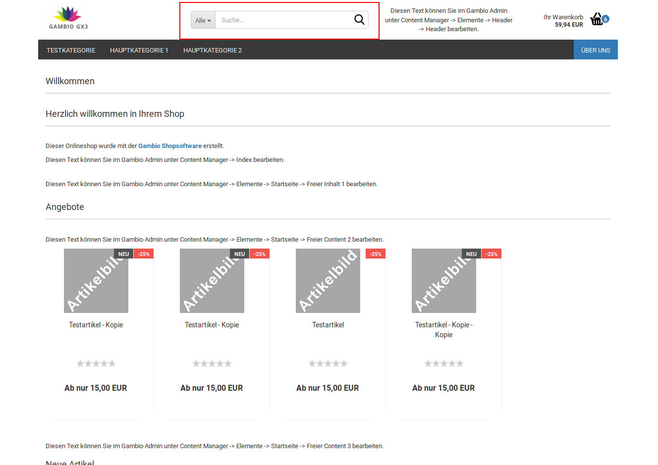
| Field name | Description |
|---|---|
| Show search in top navigation | activates the entry Search in the secondary navigation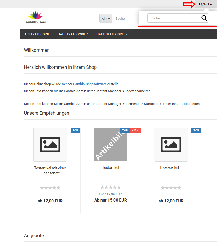 |
| Hide search in header | hides the search area in the header (reduces the number of grid columns used) |
| Color of the search icon mobile | Color of the search icon on smartphones |
| Search height | Height of the search area, specified in pixels by default, e.g. 80px |
| Search height sticky | Height of the search area in the sticky header, specified in pixels by default, e.g. 60px |
| vertical spacing | Distance of the search window to the upper and lower edge of the search area, specified in pixels by default, e.g. 22px |
| vertical spacing sticky | Distance of the search window to the upper and lower edge of the search area in the sticky header, specified in pixels by default, e.g. 12px |
| vertical outer spacing | Distance of the search area to the upper and lower edge of the header |
| vertical outer spacing sticky | Distance of the search area to the upper and lower edge of the sticky header |
| Grid columns small | Number of grid columns of the search area for small display, typically tablet in portrait format |
| Grid columns medium | Number of grid columns of the search area for medium-sized display, typically tablet in landscape format |
| Grid columns large | Number of grid columns of the search area for large display, typically desktop computers |
Note
Sticky refers to the reduced form of the header that is used when scrolling down with a fixed header.
Note
The graphical interface of the shop is divided across its width into 12 so-called grid columns. There is a separate setting for each size (large, medium, small). The sum of all settings of a size that are not hidden must equal 12. Further information on this is provided in the chapter Grid columns.
Freely designable area
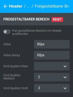
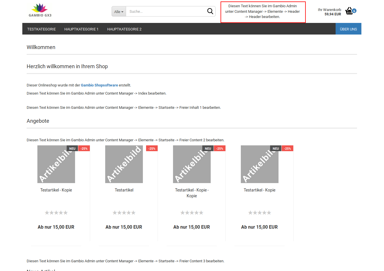
| Field name | Description |
|---|---|
| Hide freely designable area in header | hides the area in the header (reduces the number of grid columns used) |
| Height | Height of the area, specified in pixels by default, e.g. 80px |
| Height sticky | Height of the area in the sticky header, specified in pixels by default, e.g. 60px |
| Grid columns small | Number of grid columns of the area for small display, typically tablet in portrait format |
| Grid columns medium | Number of grid columns of the area for medium-sized display, typically tablet in landscape format |
| Grid columns large | Number of grid columns of the area for large display, typically desktop computers |
Note
Sticky refers to the reduced form of the header that is used when scrolling down with a fixed header.
Note
The graphical interface of the shop is divided across its width into 12 so-called grid columns. There is a separate setting for each size (large, medium, small). The sum of all settings of a size that are not hidden must equal 12. Further information on this is provided in the chapter Grid columns.
Small shopping cart
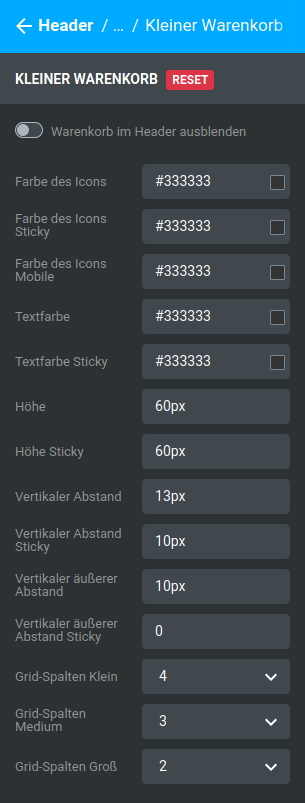
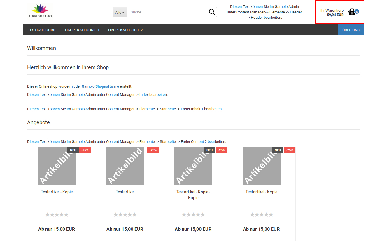
| Field name | Description |
|---|---|
| Hide shopping cart in header | hides the shopping cart area in the header (reduces the number of grid columns used) |
| Color of the icon | Color of the shopping cart symbol |
| Color of the icon sticky | Color of the shopping cart symbol in the sticky header |
| Color of the icon mobile | Color of the shopping cart symbol in the mobile view |
| Text color | Color of the text Your shopping cart and the amount |
| Text color sticky | Color of the text Your shopping cart and the amount in the sticky header |
| Height | Height of the shopping cart area in the header |
| Height sticky | Height of the shopping cart area in the sticky header |
| Vertical spacing | Distance of the shopping cart icon and lettering from the upper and lower edge of the shopping cart area |
| Vertical spacing sticky | Distance of the shopping cart icon and lettering from the upper and lower edge of the shopping cart area in the sticky header |
| Vertical outer spacing | Distance of the shopping cart area to the upper and lower edge of the surrounding header |
| Vertical outer spacing sticky | Distance of the shopping cart area to the upper and lower edge of the surrounding sticky header |
| Grid columns small | Number of grid columns of the shopping cart area for small display, typically tablet in portrait format |
| Grid columns medium | Number of grid columns of the shopping cart area for medium-sized display, typically tablet in landscape format |
| Grid columns large | Number of grid columns of the shopping cart area for large display, typically desktop computers |
Note
Sticky refers to the reduced form of the header that is used when scrolling down with a fixed header.
Note
The graphical interface of the shop is divided across its width into 12 so-called grid columns. There is a separate setting for each size (large, medium, small). The sum of all settings of a size that are not hidden must equal 12. Further information on this is provided in the chapter Grid columns.
Categories
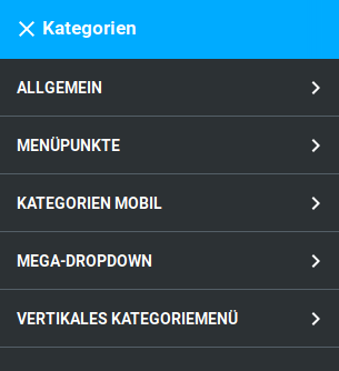
General
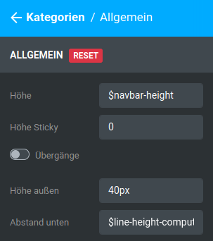
| Field name | Description |
|---|---|
| Height | Height of the inner area of the horizontal navigation bar, pre-filled with the placeholder $navbar-height |
| Height sticky | Height of the inner area of the horizontal navigation bar in the sticky header, pre-filled with 0 by default |
| Transitions | smoother fade-in of the mega dropdown when the mouse pointer is moved over a category with subcategories |
| Height outer | Height of the outer area of the horizontal navigation bar |
| Spacing bottom | Lower spacing to the category bar, pre-filled with the placeholder $line-height-computed |
Note
Sticky refers to the reduced form of the header that is used when scrolling down with a fixed header.
Menu items
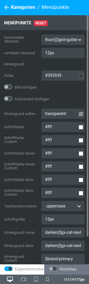

| Field name | Description |
|---|---|
| horizontal spacing | left spacing of the entries of the secondary navigation, pre-filled with floor(($grid-gutter-width/2)) |
| vertical spacing | Spacing above and below the entries for main categories |
| Background | |
| Color | Background color of the horizontal menu bar (without content entries) |
| Insert image | Background image of the horizontal menu bar (without content entries) |
| Insert gradient | Color gradient for the background of the horizontal menu bar (without content entries) |
| Background outer | Background color that is displayed in the continuation of the horizontal menu bar on the left and right |
| Font color | Font color of the main categories (without subcategories and content entries) in the horizontal menu bar |
| Font color custom | Font color of the content entries in the horizontal menu bar |
| Font color hover | Font color of the main categories (without subcategories and content entries) in the horizontal menu bar when hovering with the mouse pointer, without subcategories being expanded |
| Font color hover custom | Font color of the content entries in the horizontal menu bar when hovering with the mouse pointer |
| Font color active | Font color of the main category in the horizontal menu bar that is currently displayed |
| Font color active custom | Font color of the content page in the horizontal menu bar that is currently displayed |
| Text transformation | Changes the capitalization of the labeling of the main category in the horizontal menu bar |
| none: Text is output as it is stored in the shop as the category name | |
| uppercase: Text is output in uppercase letters | |
| lowercase: Text is output in lowercase letters | |
| capitalize: Every word begins with a capital letter | |
| Font size | Font size of the main categories in the horizontal and vertical menu bar |
| Background hover | Background color of the main categories in the horizontal menu bar when hovering with the mouse, pre-filled with darken($gx-cat-navbar-bg-color, 6.5%) |
| Background active | Background color of the currently displayed main category in the horizontal category bar, pre-filled with darken($gx-cat-navbar-bg-color, 6.5%) |
| Background custom | Background color of the content entries in the horizontal menu bar, pre-filled with $brand-primary |
| Background hover custom | Background color of the content entries in the horizontal menu bar when hovering with the mouse, pre-filled with darken($gx-custom-bg-color, 10%) |
| Background active custom | Background color of the content entry in the horizontal menu bar that is currently displayed, pre-filled with darken($gx-custom-bg-color, 10%) |
Note
Hovering or mouseover refers to placing the mouse pointer over an element without clicking on it
Categories mobile
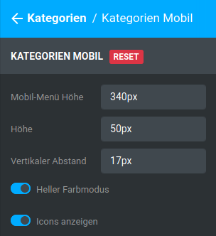
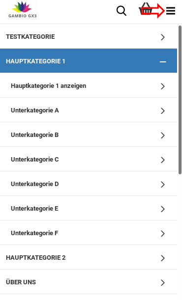
| Field name | Description |
|---|---|
| Mobile menu height | Height of the mobile menu |
| Height | Height of the menu entries |
| Vertical spacing | Distance of the name to the upper edge of the menu entry |
| Light color mode | Switching between light color mode (white background, dark font) and dark color mode (dark background, white font) |
| Show icons | Show icons in the mobile menu yes/no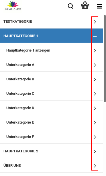 |
Mega dropdown
| Field name | Description |
|---|---|
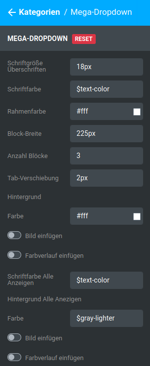
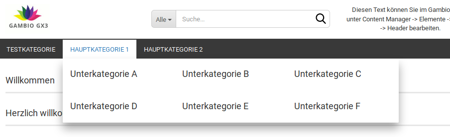
| Font size headings | Font size of the entries in the dropdown of the category menu |
| Font color | Font color of the entries in the dropdown of the category menu, pre-filled with $text-color |
| Border color | Color of the border elements of the entries in the dropdown of the category menu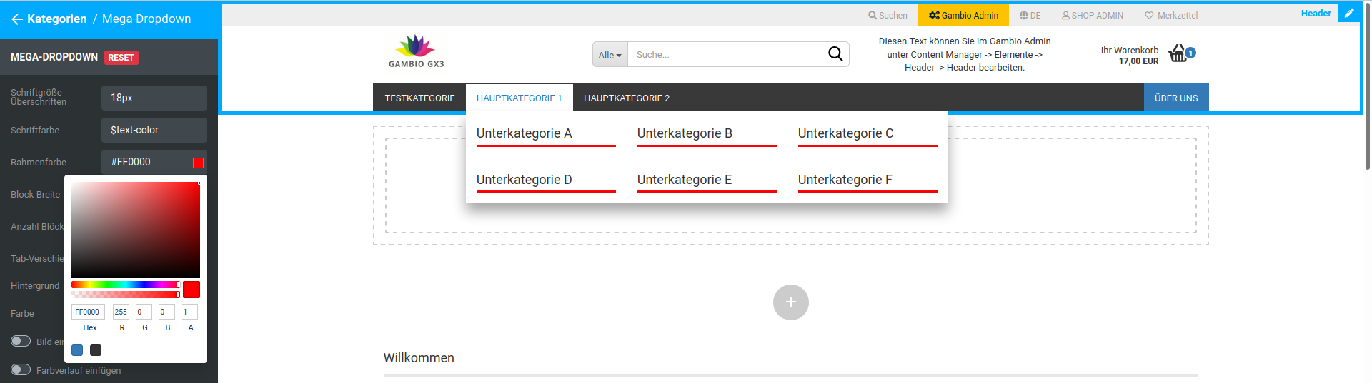 |
| Block width | Width of the subcategory blocks in the mega dropdown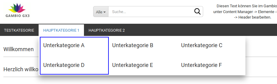 |
| Number of blocks | Number of blocks displayed next to each other in the mega dropdown |
| Tab offset | inner spacing of the individual menu entries, pre-filled with 2px |
| Background | |
| Color | Background color of the mega dropdown |
| Insert image | Background image of the mega dropdown |
| Insert gradient | Using a color gradient for the background of the mega dropdown |
| Font color show all | Font color of the button Show all, pre-filled with $text-color |
| Background show all | |
| Color | Background color of the button Show all, pre-filled with $gray-lighter |
| Insert image | Background image of the button Show all |
| Insert gradient | Color gradient as the background image of the button Show all |
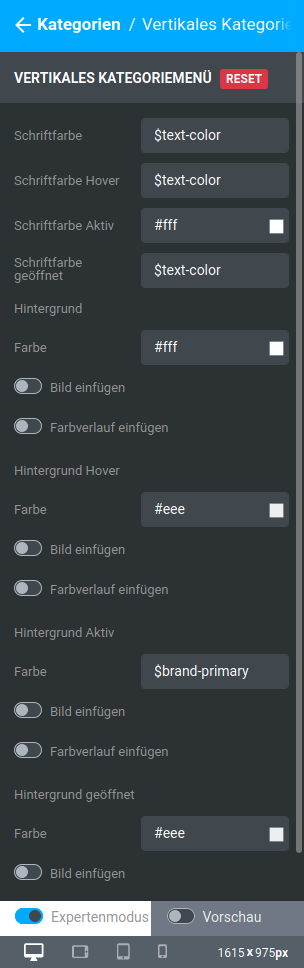
Vertical category menu
| Field name | Description |
|---|---|
| Font color | Font color of the vertical category menu, pre-filled with $text-color |
| Font color hover | Font color of the vertical category menu when hovering, pre-filled with $text-color |
| Font color active | Font color of the currently displayed category in the vertical category menu |
| Font color open | Font color of the expanded categories in the vertical category menu, pre-filled with $text-color |
| Background | |
| Color | Background color of the vertical category menu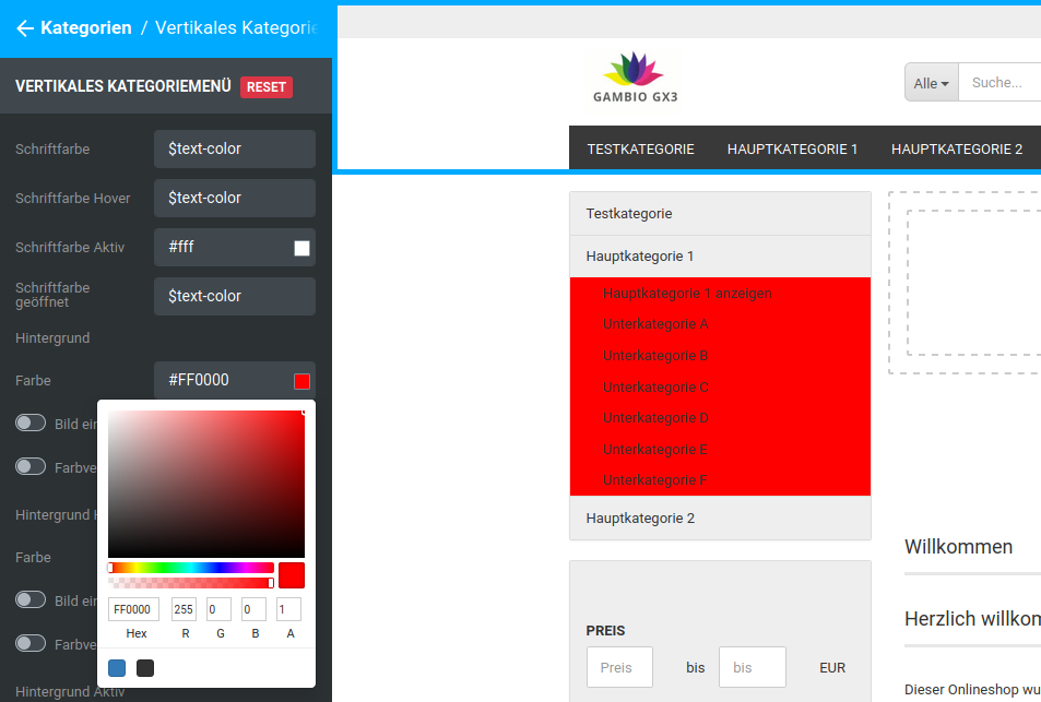 |
| Insert image | Background image of the vertical category menu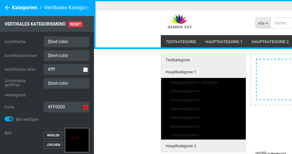 |
| Insert gradient | Color gradient as the background in the vertical category menu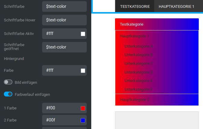 |
| Background hover | |
| Color | Background color of the submenu entry in the vertical category menu when hovering with the mouse |
| Insert image | Background image of the menu entry in the vertical category menu when hovering with the mouse |
| Insert gradient | Color gradient as the background of the menu entry in the vertical category menu when hovering with the mouse |
| Background active | |
| Color | Background color of the currently displayed category in the vertical category menu, pre-filled with $brand-primary |
| Insert image | Background image of the currently displayed category in the vertical category menu |
| Insert gradient | Color gradient as the background of the displayed category in the vertical category menu |
| Background open | |
| Color | Background color of the currently expanded main category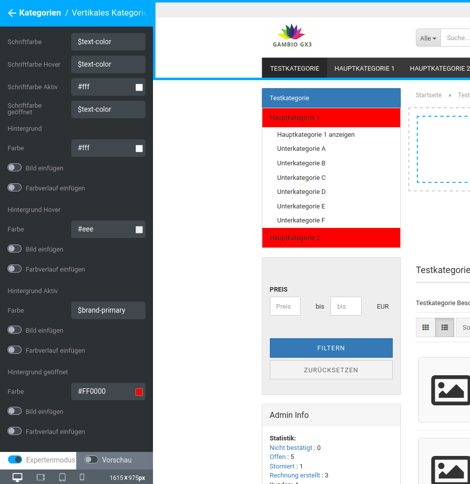 |
| Insert image | Background image of the main categories in the vertical category menu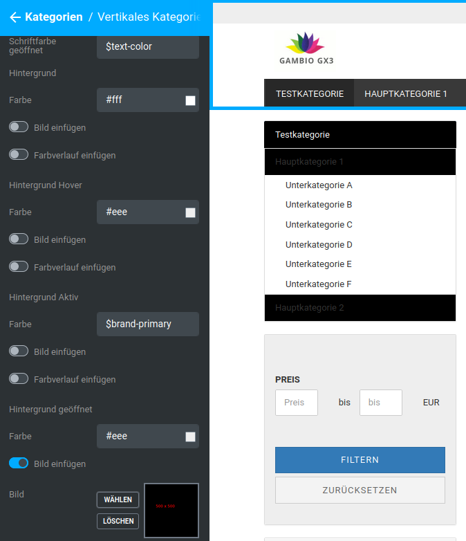 |
| Insert gradient | Color gradient as the background of the main categories in the vertical category menu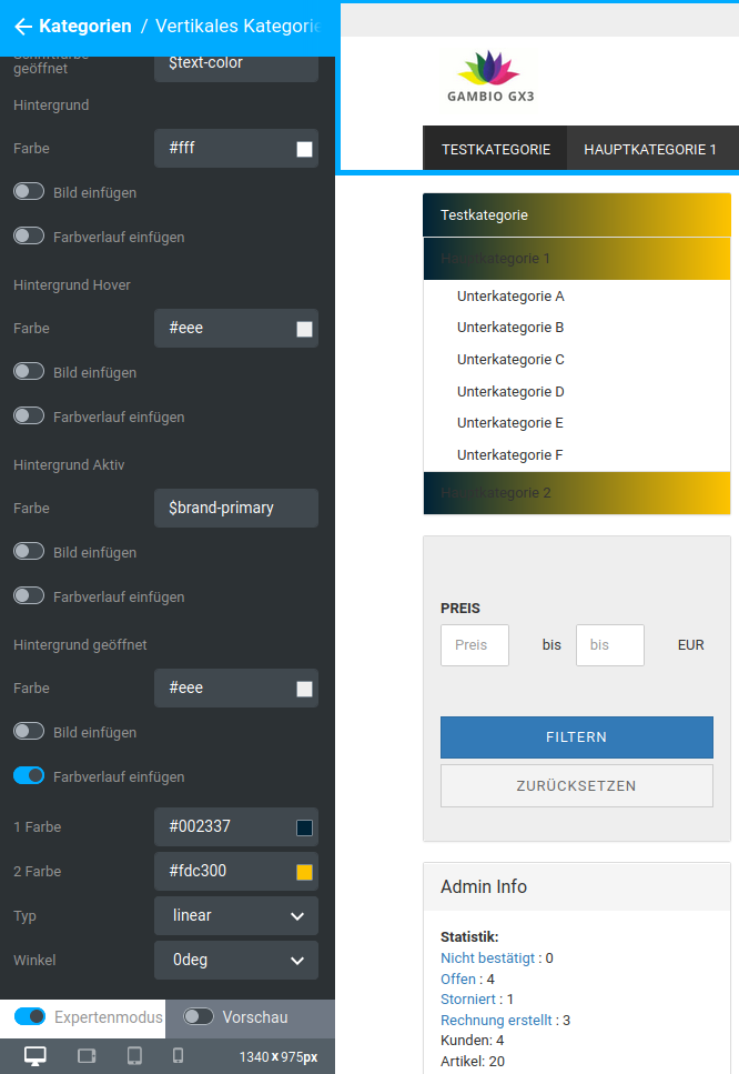 |
Note
Hovering or mouseover refers to placing the mouse pointer over an element without clicking on it
Secondary navigation
General
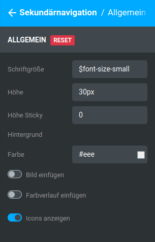
| Field name | Description |
|---|---|
| Font size | Font size of the menu entries in the secondary navigation, pre-filled with $font-size-small |
| Height | Height of the entries of the secondary navigation |
| Height sticky | Height of the entries of the secondary navigation in the sticky view |
| Background | |
| Color | Background color of the secondary navigation bar |
| Insert image | Background image of the secondary navigation bar |
| Insert gradient | Color gradient as the background of the secondary navigation bar |
Note
Sticky refers to the reduced form of the header that is used when scrolling down with a fixed header.
Note
Hovering refers to placing the mouse pointer over an element without clicking on it
Menu items
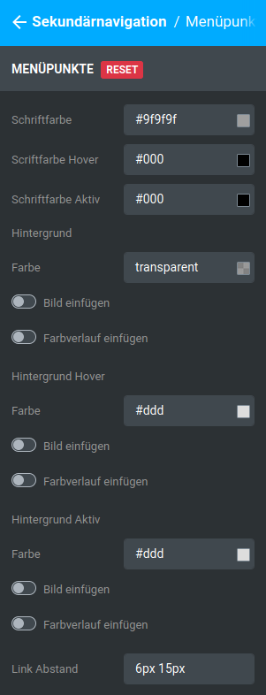
| Field name | Description |
|---|---|
| Font color | Font color of the menu entries in the secondary navigation, excluding the Gambio Admin button |
| Font color hover | Font color of the menu entries in the secondary navigation when hovering, excluding the Gambio Admin button |
| Font color active | Font color of the menu entries in the secondary navigation when a dropdown is expanded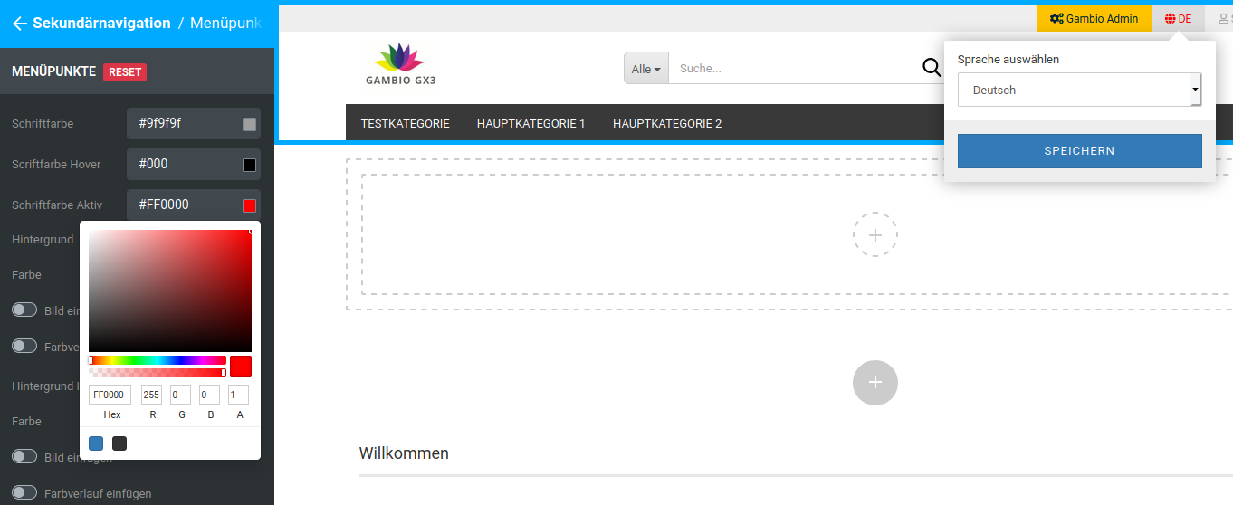 |
| Background | |
| Color | Background color of the menu entries of the secondary navigation, excluding the Gambio Admin button, pre-filled with transparent |
| Insert image | Background image of the menu entries of the secondary navigation |
| Insert gradient | Color gradient as the background of the menu entries of the secondary navigation |
| Background hover | |
| Color | Background color of the menu entries of the secondary navigation when hovering with the mouse, excluding the Gambio Admin button |
| Insert image | Background image of the menu entries of the secondary navigation when hovering with the mouse |
| Insert gradient | Color gradient as the background of the menu entries of the secondary navigation when hovering with the mouse |
| Background active | |
| Color | Background color of the menu entries in the secondary navigation when a dropdown is expanded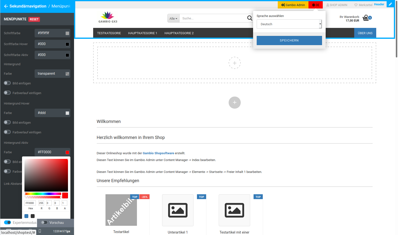 |
| Insert image | Background image of the menu entries in the secondary navigation when a dropdown is expanded |
| Insert gradient | Color gradient as the background of the menu entries of the secondary navigation when a dropdown is expanded |
| Link spacing | inner spacing of the text to the top and bottom or left and right to the edge of the button, pre-filled with 6px 15px |
Note
Hovering refers to placing the mouse pointer over an element without clicking on it
Categories mobile
These settings currently have no function and will be removed in a future version.
Column layout
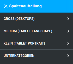
Via the area Column layout, the aspect ratio of the individual areas in the shop can be defined. Here, the main area of the shop is divided into 12 columns of equal width.
Attention
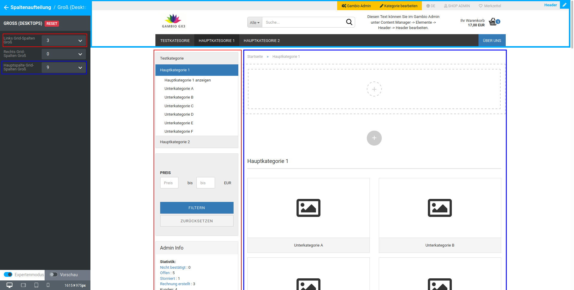
The sum of the column settings for a size (e.g. 'Large (Desktops)') must always equal 12, otherwise display errors will occur.
For the desktop view, a layout of 3 columns for the left part of the page and 9 columns for the middle part is preset by default.
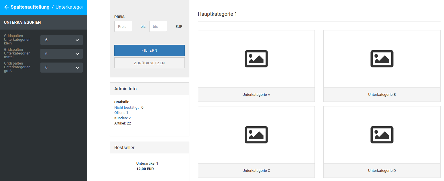
When setting the subcategories, the number of categories displayed in one row is determined as follows:
12 / grid columns subcategories = number of subcategories per row
Footer
Variants
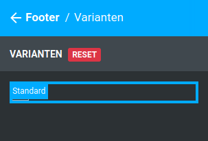
The individual variants of the footer can be selected here. In the Honeygrid, the variant Standard is available.
Standard
Footer header
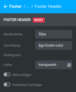
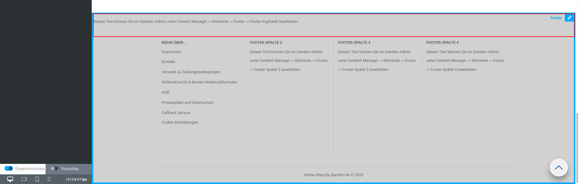
The footer header is the continuous row above the columns of the footer.
| Field name | Description |
|---|---|
| Minimum height | minimum height taken up by the footer header, even if the space is not needed by the associated content |
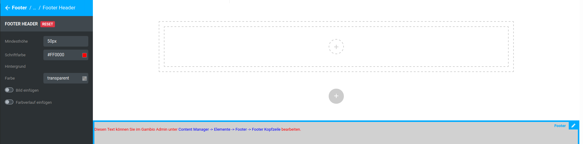
| Font color | Font color that is used by default in the footer header, pre-filled with _$gx-footer-color |
Note
The content displayed in this area has its own color settings, which have a higher priority than the basic setting of the StyleEdit. We recommend making the general setting with the StyleEdit and, if necessary, coloring only parts of the content differently via the Content Manager or CK editor.
| Field name | Description |
|---|---|
| Background | |
| Color | Background color of the footer header, pre-filled with transparent |
| Insert image | Background image of the footer header |
| Insert gradient | Color gradient as the background of the footer header |
Footer body
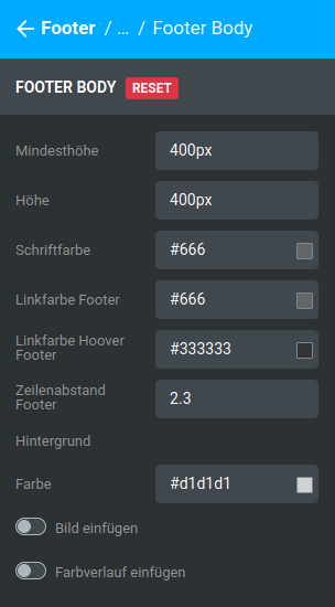
| Field name | Description |
|---|---|
| Minimum height | minimum height of the footer body |
| Height | Height of the footer body |
Note
The height of the footer should not fall below the minimum height
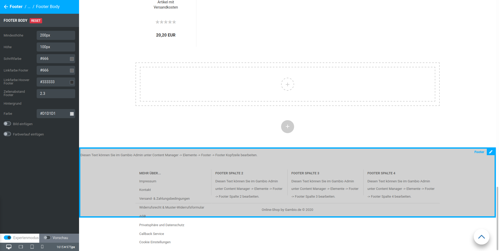
| Field name | Description |
|---|---|
| Font color | Font color of the footer as a whole, without links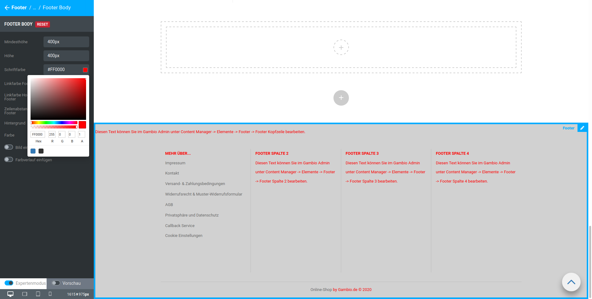 |
| Link color footer | Link color within the footer, except footer header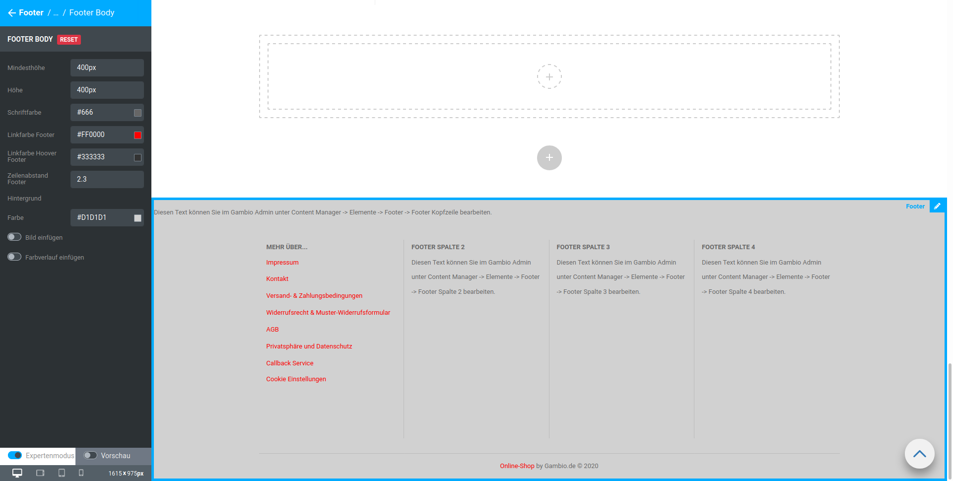 |
| Link color hover footer | Link color within the footer when hovering (moving the mouse over it), except footer header |
| Line spacing footer | Line spacing of paragraphs within the footer columns |
| Background | |
| Color | Background color of the footer |
| Insert image | Background image of the footer |
| Insert gradient | Color gradient as the background of the footer |
Note
Hovering or mouseover refers to placing the mouse pointer over an element without clicking on it
Footer column N
This section describes the settings for footer column 1 to footer column 4.
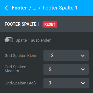
| Field name | Description |
|---|---|
| Hide column 1 | hides the column within the footer |
| Grid columns small | Number of grid columns for this column of the footer on small output devices (e.g. smartphone) |
| Grid columns medium | Number of grid columns for this column of the footer on medium-sized output devices (e.g. tablets) |
| Grid columns large | Number of grid columns for this column of the footer on large output devices (e.g. desktop computers) |
Note
The graphical interface of the shop is divided across its width into 12 so-called grid columns. There is a separate setting for each size (large, medium, small). The sum of all settings of a size that are not hidden must equal 12. Further information on this is provided in the chapter Grid columns.
It should be noted here that the columns of the footer are also displayed below one another on smaller screens. The following applies
12 / number of grid columns = number of footer columns displayed next to each other
Products
Product image
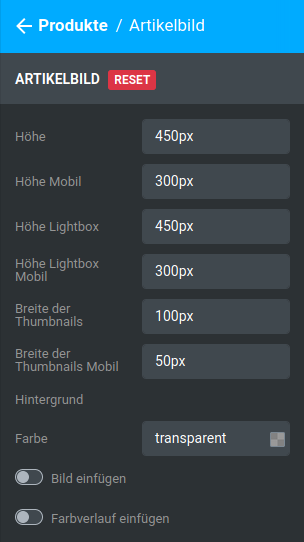
| Field name | Description |
|---|---|
| Height | Height of the product image area on the product details page |
| Height mobile | Height of the product image area in the mobile view (tablet and smartphone) |
| Height lightbox | Height of the product image area in the lightbox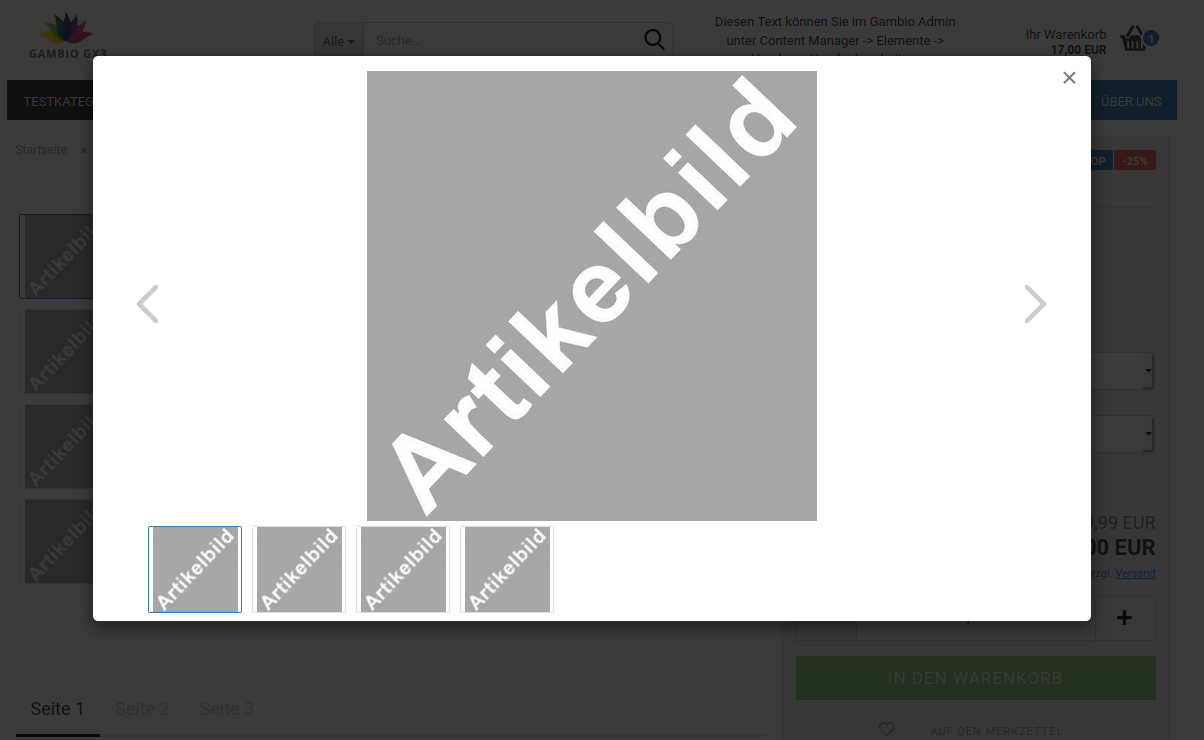 |
| Height lightbox mobile | Height of the product image area in the lightbox in the mobile view (tablet) |
| Width of the thumbnails | Width of the product image area of the small preview images |
| Width of the thumbnails mobile | Width of the product image area of the small preview images in the mobile view |
| Background | |
| Color | Background color of the product image area, pre-filled with transparent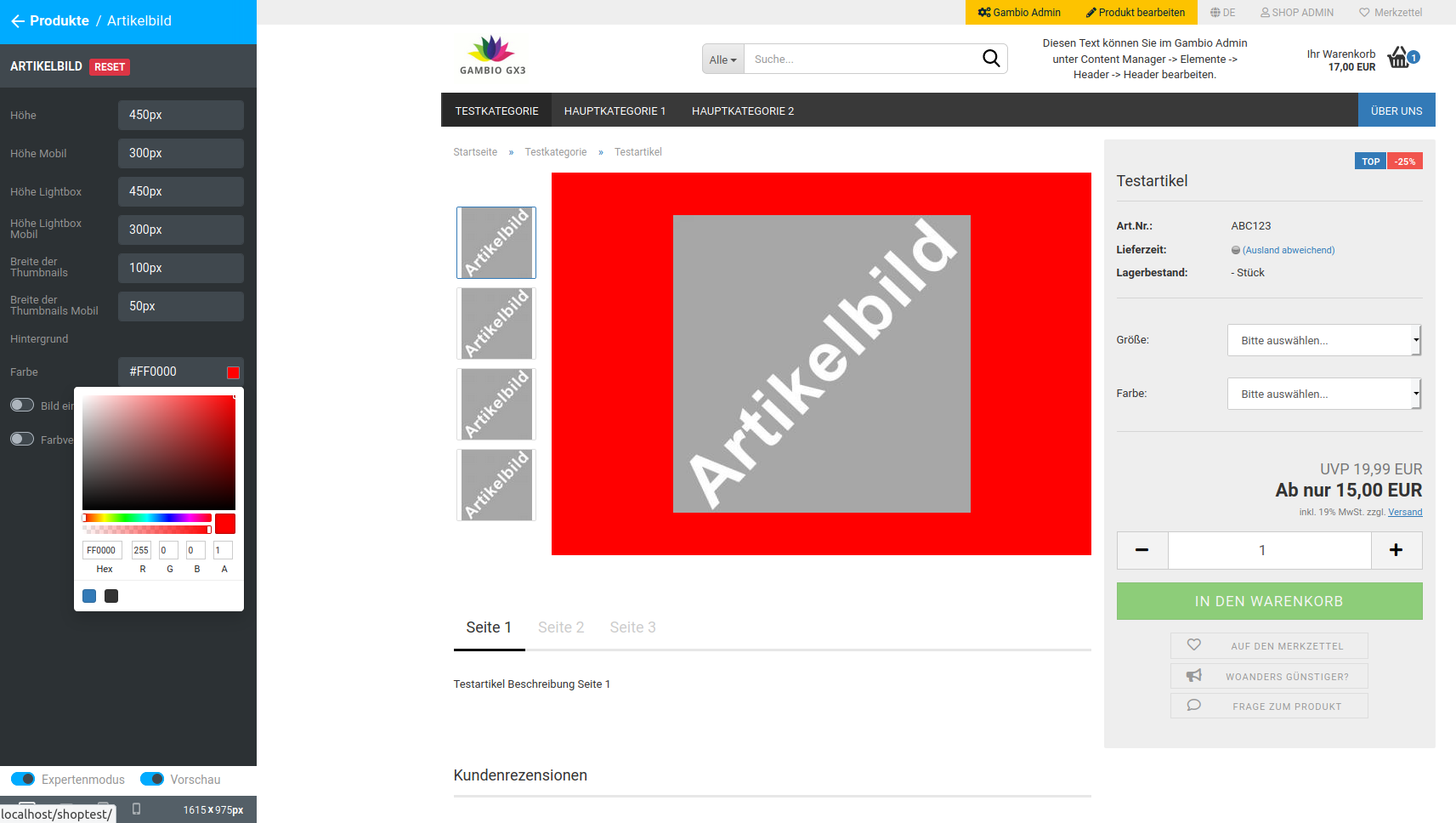 |
| Insert image | Background image of the product image area |
| Insert gradient | Color gradient as the background of the product image area |
Note
The product image area determines how much space is available for the respective product image. Since changing one dimension (height or width) scales the other accordingly, the image area cannot be enlarged indefinitely.
Product list
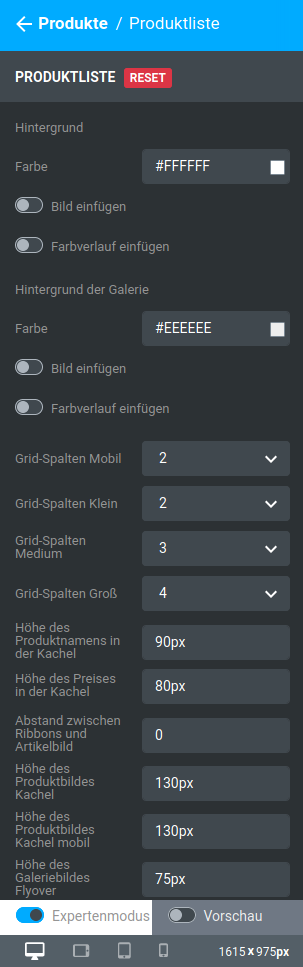
Product lists can be both categories and other product pages, such as the listing of special offers
| Field name | Description |
|---|---|
| Background | |
| Color | Background color of the product in the product list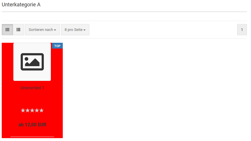 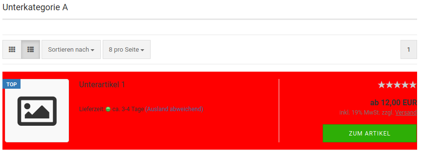 |
| Insert image | Background image of the product in the product list |
| Insert gradient | Color gradient as the background of the product in the product list |
| Background of the gallery | |
| Color | Background color of the gallery area in product lists in tiled view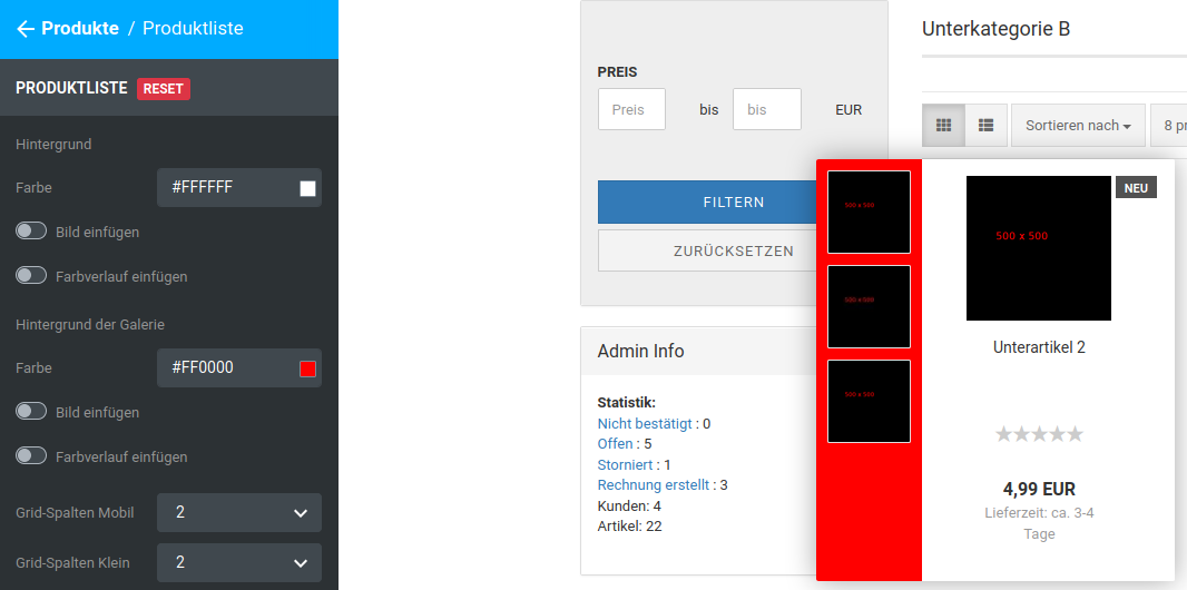 |
| Insert image | Background image of the gallery area in product lists in tiled view |
| Insert gradient | Color gradient as the background of the gallery area |
| Grid columns mobile | Number of columns in tiled view of the product list, smartphone view |
| Grid columns small | Number of columns in tiled view of the product list, tablet portrait view |
| Grid columns medium | Number of columns in tiled view of the product list, tablet landscape view |
| Grid columns large | Number of columns in tiled view of the product list, desktop view |
| Height of the product name in the tile | Height of the area of the product tile in which the product name is displayed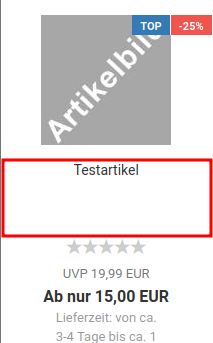 |
| Height of the price in the tile | Height of the area of the product tile in which the price is displayed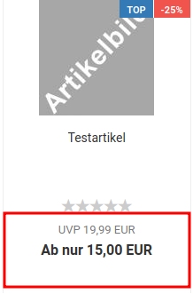 |
| Spacing between ribbons and product image | vertical spacing, pre-filled with 0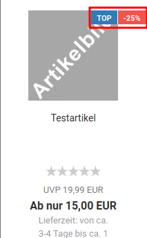 |
| Height of the product image tile | Height of the image area in the tiled view |
| Height of the product image tile mobile | Height of the image area in the tiled view (smartphone) |
| Height of the gallery image flyover | Height of the image area in the gallery of the tiled view (mouseover/hover) |
| Width of the gallery | Width of the gallery area of the tiled view (mouseover/hover) |
| Always show delivery time in tile | Delivery time is displayed continuously, not only on mouseover |
Note
Hovering or flyover refers to placing the mouse pointer over an element without clicking on it.
Product details box
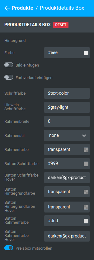
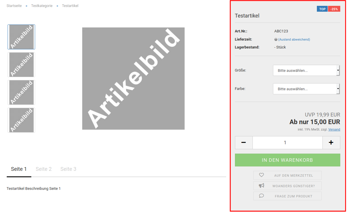
| Field name | Description |
|---|---|
| Background | |
| Color | Background color of the product details box |
| Insert image | Background image of the product details box |
| Insert gradient | Color gradient as the background of the product details box |
| Font color | Font color in the product details box, pre-filled with $text-color |
| Notice font color | Font color for the price, tax and shipping cost notice, pre-filled with $gray-light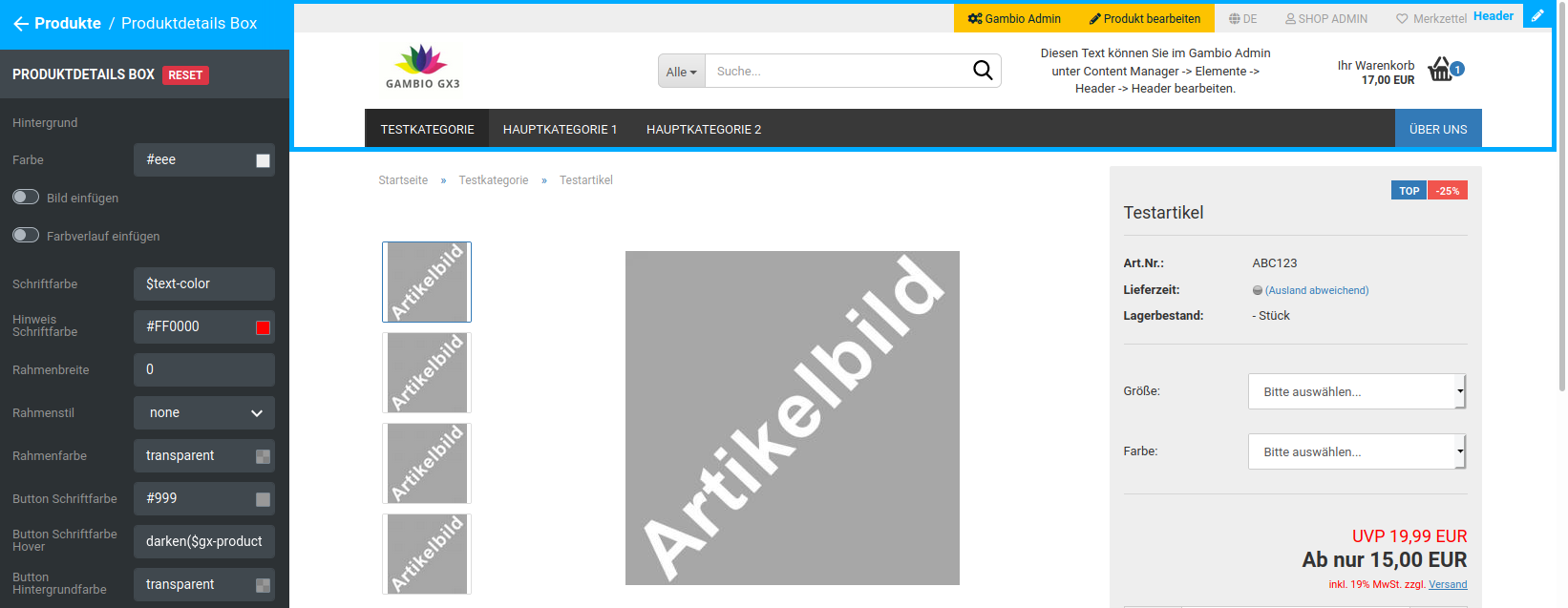 |
| Border width | Width of the border around the product details box, pre-filled with 0 |
| Border style | Style of the border around the product details box, pre-filled with none |
| Border color | Color of the border around the product details box, pre-filled with transparent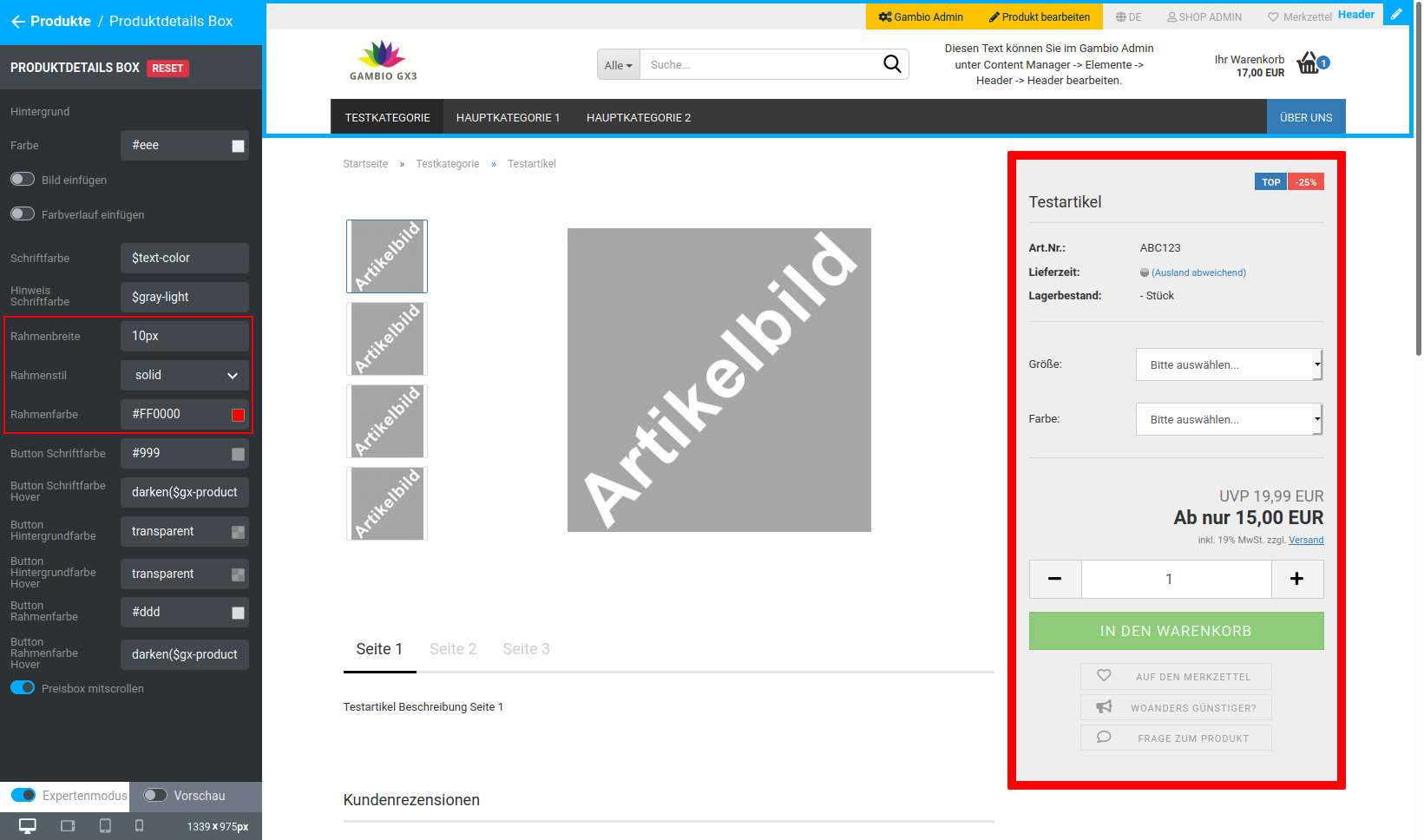 |
| Button font color | Font color of the buttons below the shopping cart button 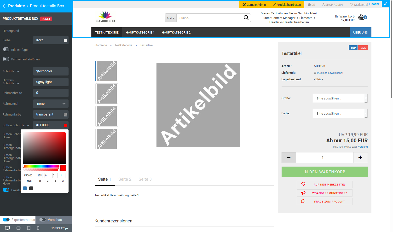 |
| Button font color hover | Font color of the buttons below the shopping cart button on mouseover/hover, pre-filled with darken($gx-product-info-button-color, 10%) |
| Button background color | Background color of the buttons below the shopping cart button, pre-filled with transparent |
| Button background color hover | Background color of the buttons below the shopping cart button on mouseover/hover, pre-filled with transparent |
| Button border color | Border color of the buttons below the shopping cart button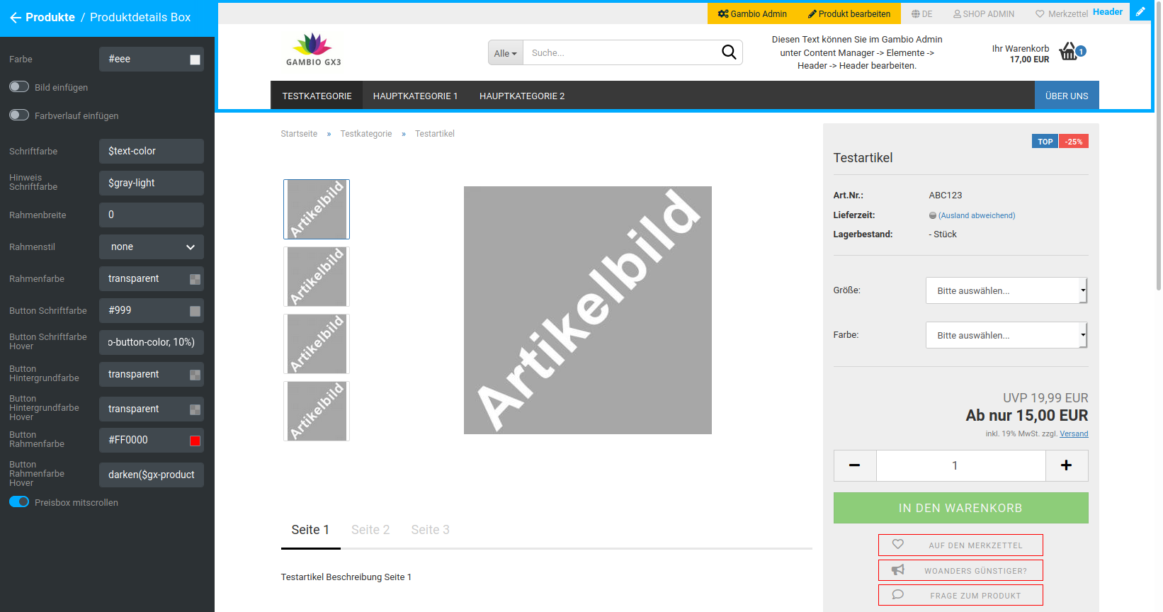 |
| Button border color hover | Border color of the buttons below the shopping cart button on mouseover/hover |
| Scroll price box | should the product details box scroll along? |
Note
Hovering refers to placing the mouse pointer over an element without clicking on it.
Tabs
| Field name | Description |
|---|---|
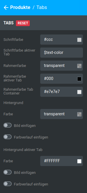
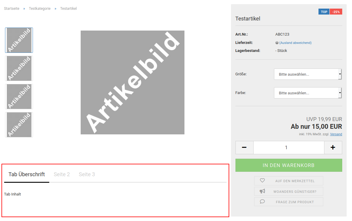
| Font color | Font color of the tab headings, except the active tab |
| Font color active tab | Font color of the heading of the active tab, pre-filled with $text-color |
| Border color | Color of the lower delimitation of the tab headings, pre-filled with transparent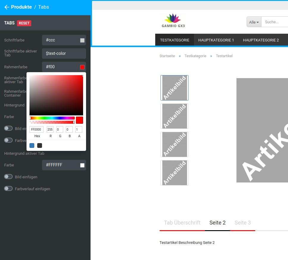 |
| Border color active tab | Color of the lower delimitation of the active tab |
| Border color tab container | Color of the delimitation between headings and tab contents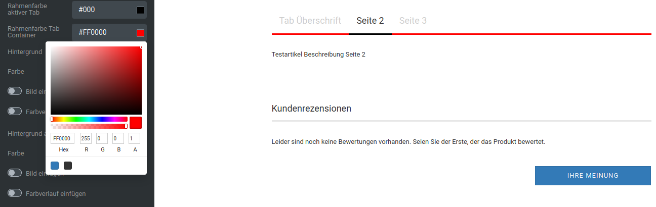 |
| Background | |
| Color | Background color of the tab headings, except the active tab, pre-filled with transparent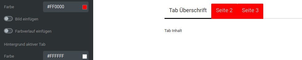 |
| Insert image | Background image of the tab headings, except the active tab |
| Insert gradient | Color gradient as the background of the tab headings, except the active tab |
| Background active tab | |
| Color | Background color of the heading of the active tab |
| Insert image | Background image of the heading of the active tab |
| Insert gradient | Color gradient as the background of the heading of the active tab |
Ribbons
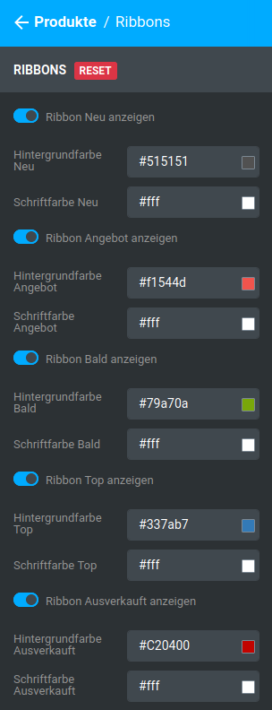
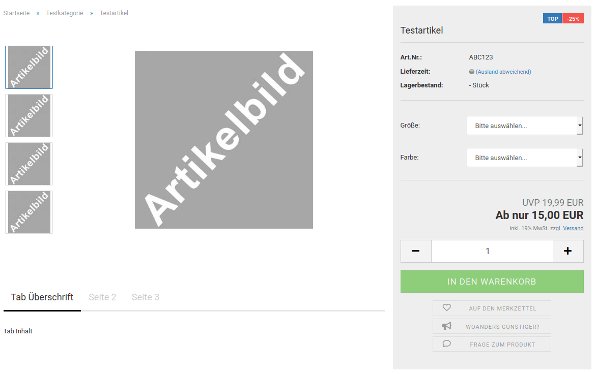
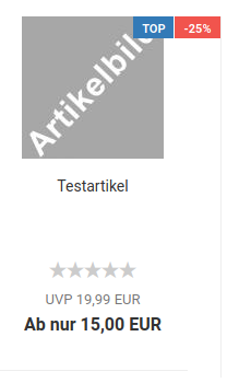

| Field name | Description |
|---|---|
| Show ribbon | Ribbon is used for matching products |
| Background color | Background color of the ribbon |
| Font color | Font color of the ribbon |
Checkout
General
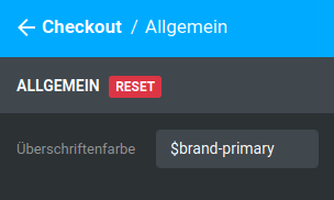
| Field name | Description |
|---|---|
| Heading color | Heading color of the individual subsections within the pages of the checkout, pre-filled with $brand-primary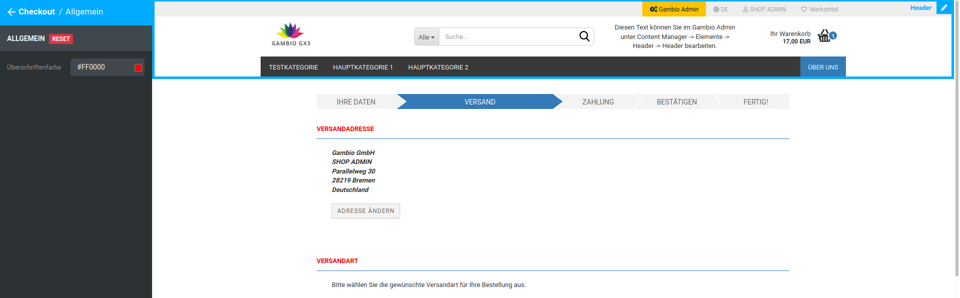 |
Share shopping cart
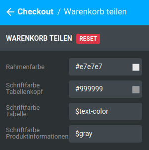
| Field name | Description |
|---|---|
| Border color | Color of the upper and lower delimitation of the product table of the shopping cart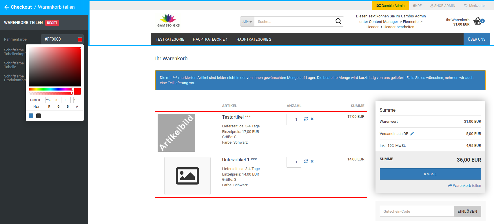 |
| Font color table header | Font color of the table headings in the shopping cart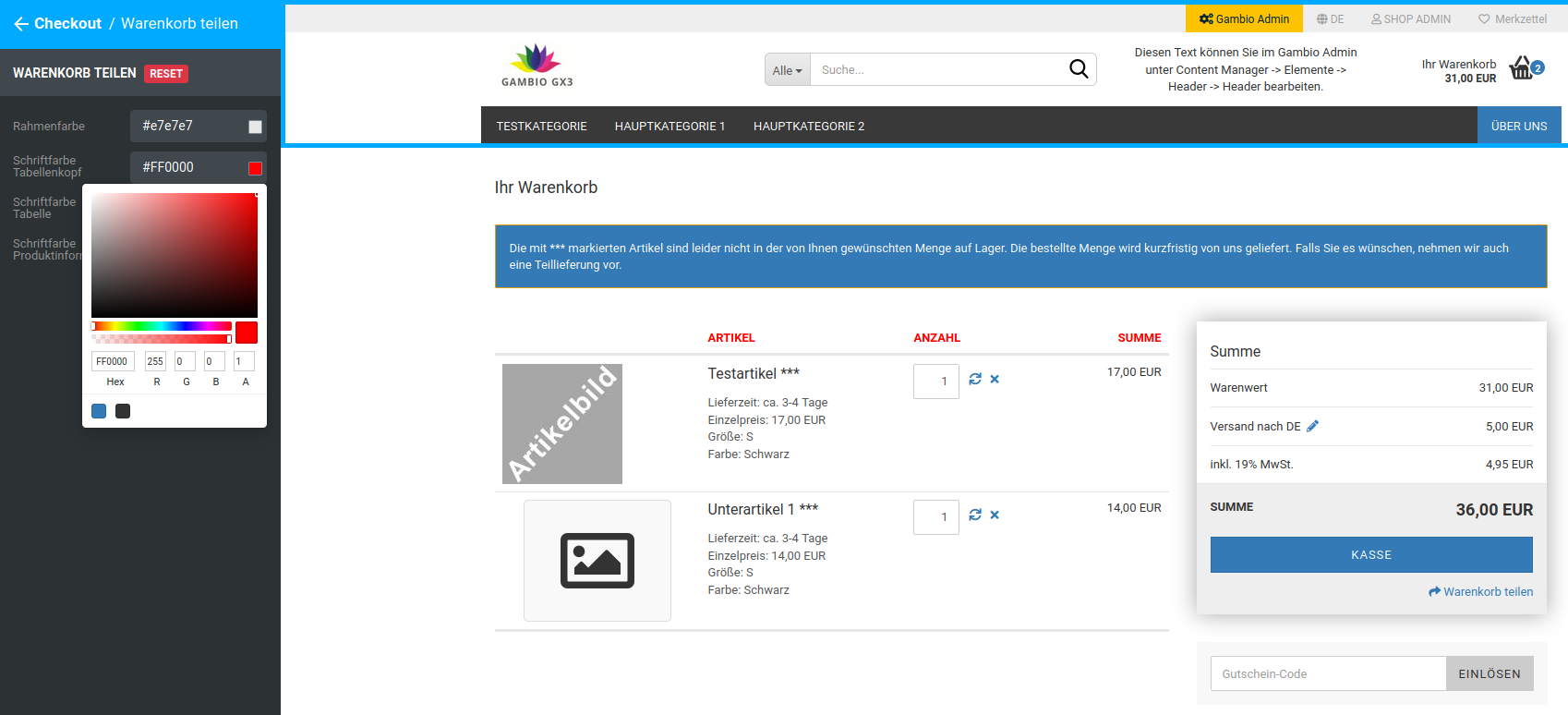 |
| Font color table | Font color of the product table of the shopping cart, without product information, pre-filled with $text-color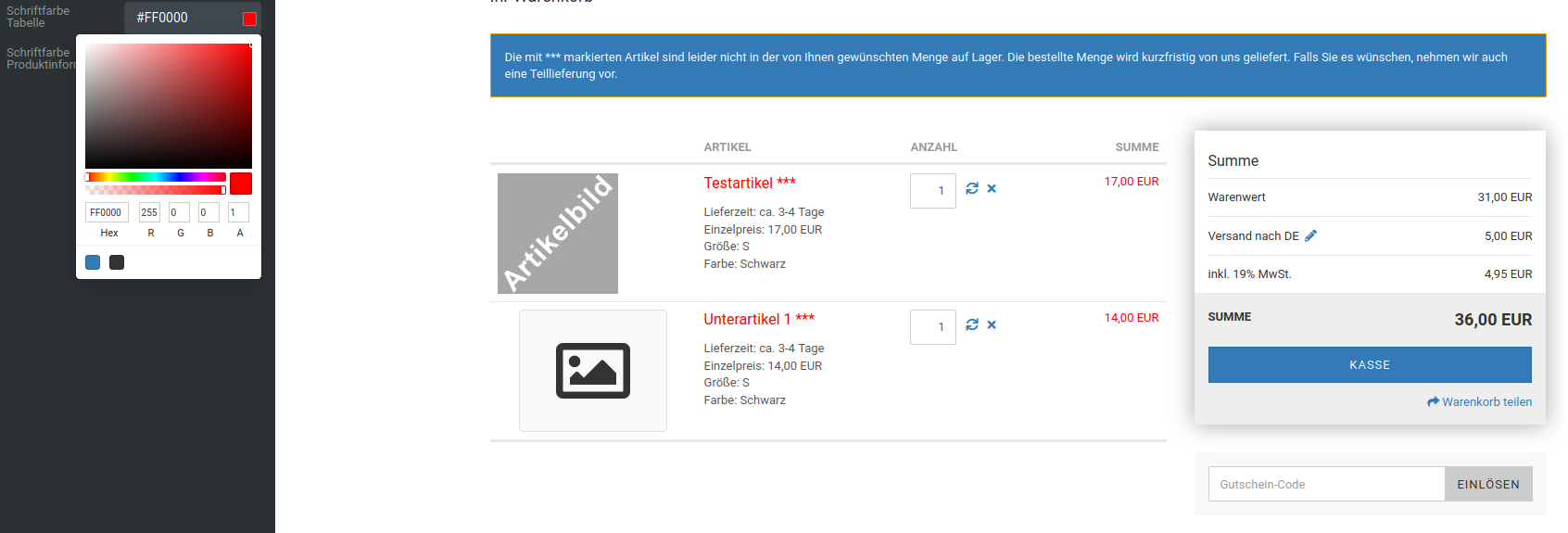 |
| Font color product information | Font color of the product information in the product table of the shopping cart, pre-filled with $gray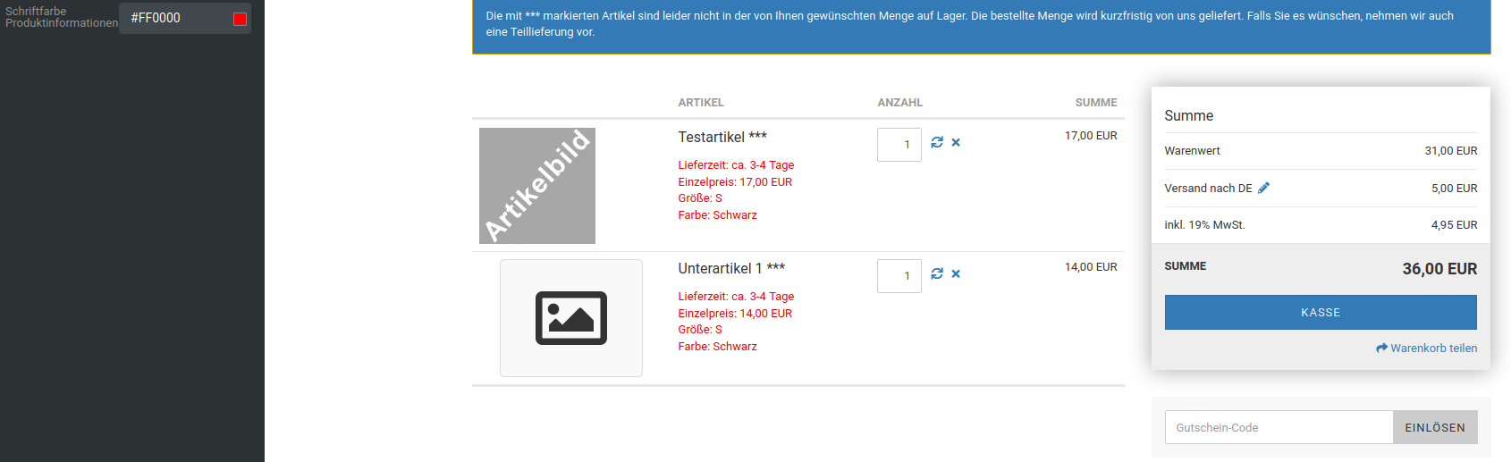 |
Shopping cart summary box
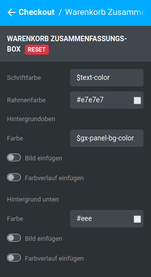
| Field name | Description |
|---|---|
| Font color | Font color in the summary box, pre-filled with $text-color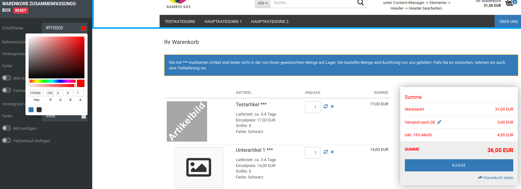 |
| Border color | Color of the horizontal separator lines of the shopping cart summary box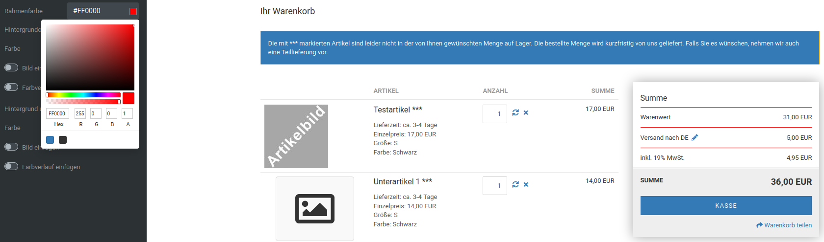 |
| Background top | |
| Color | Background color of the upper part of the summary box, pre-filled with $gx-panel-bg-color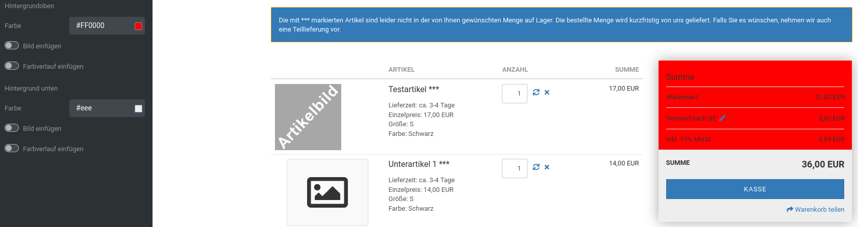 |
| Insert image | Background image of the upper part of the summary box |
| Insert gradient | Color gradient as the background of the upper part of the summary box |
| Background bottom | |
| Color | Background color of the lower part of the summary box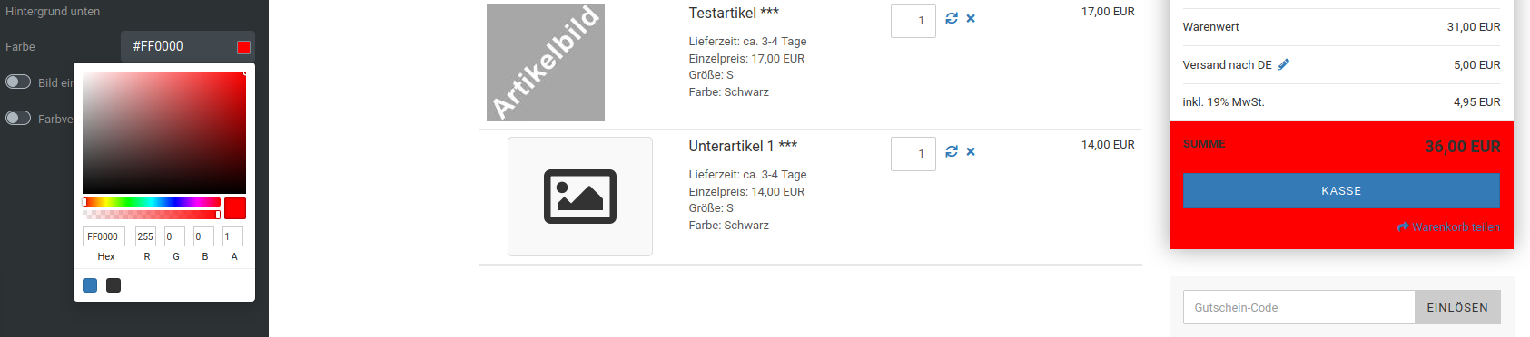 |
| Insert image | Background image of the lower part of the summary box |
| Insert gradient | Color gradient as the background of the lower part of the summary box |
Checkout summary table
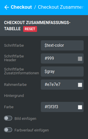
| Field name | Description |
|---|---|
| Font color | Font color, pre-filled with $text-color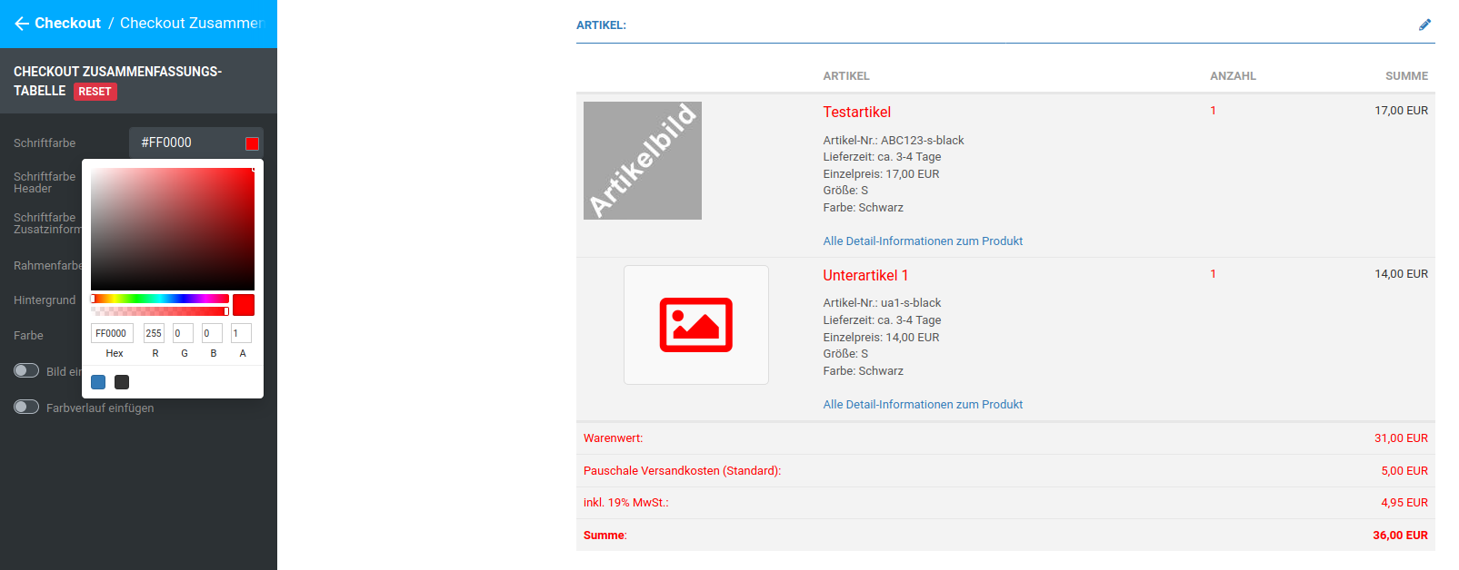 |
| Font color header | Font color of the header of the summary table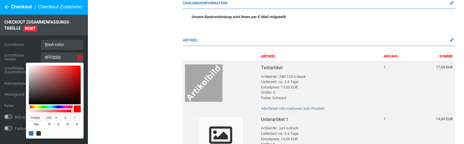 |
| Font color additional information | Font color of the additional information, pre-filled with $gray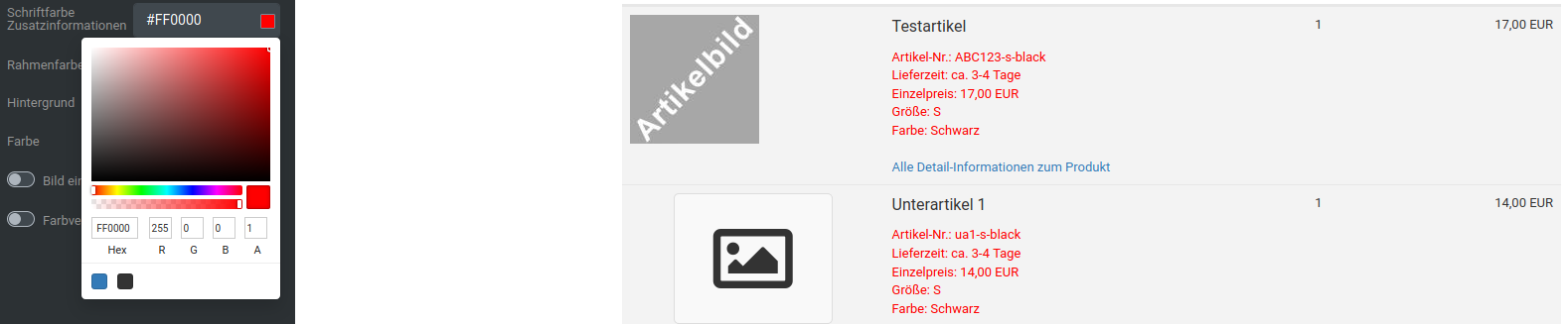 |
| Border color | Color of the horizontal separator lines between the individual entries of the summary table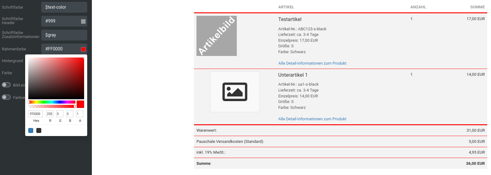 |
| Background | |
| Color | Background color of the summary table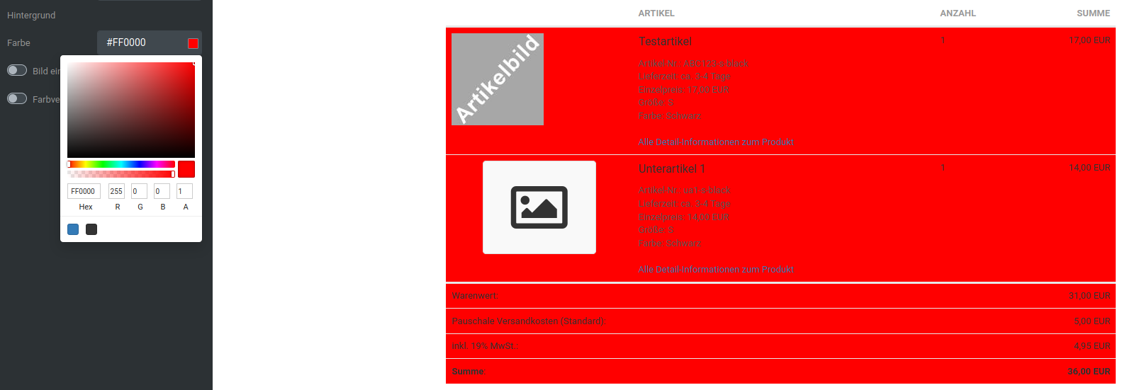 |
| Insert image | Background image of the summary table |
| Insert gradient | Color gradient as the background of the summary table |
List elements
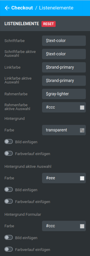
| Field name | Description |
|---|---|
| Font color | Font color of the list elements, except the active selection, pre-filled with $text-color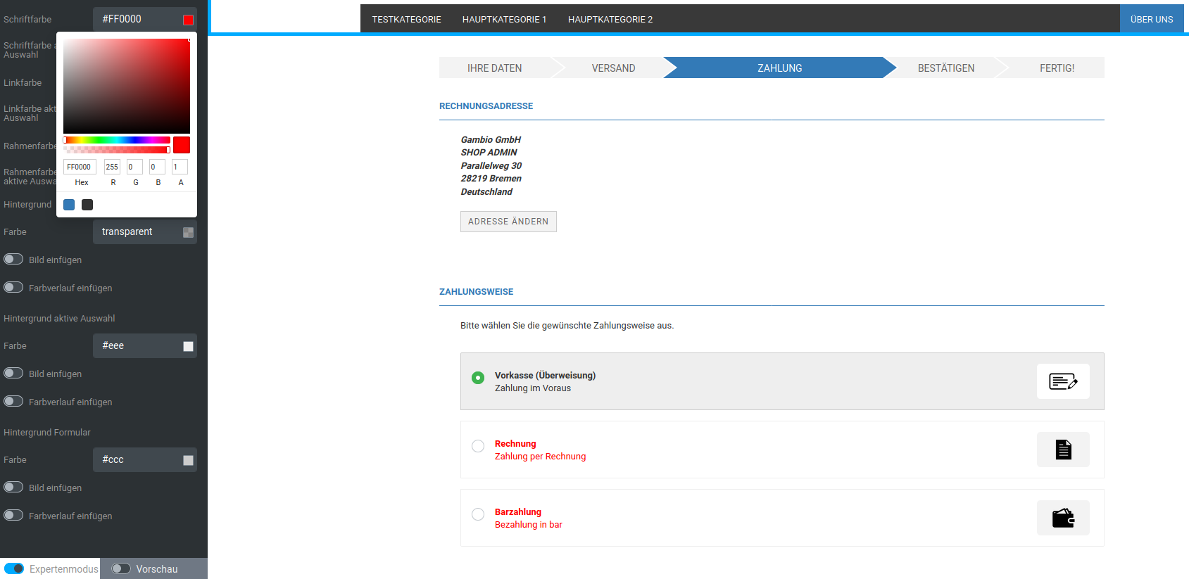 |
| Font color active selection | Font color of the currently selected list element, pre-filled with $text-color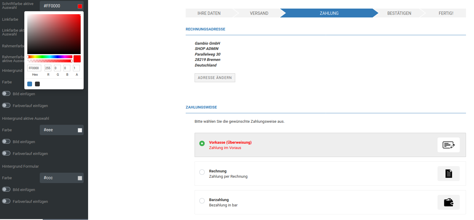 |
| Link color | Link color, except the active selection, pre-filled with $brand-primary |
| Link color active selection | Link color of the active selection, pre-filled with $brand-primary |
| Border color | Border color of the individual list entries, without the active selection, pre-filled with $gray-lighter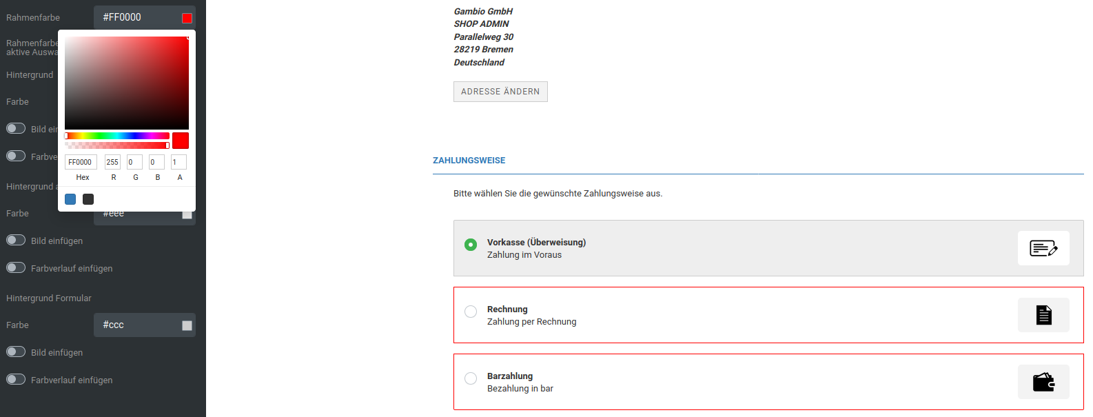 |
| Border color active selection | Border color of the currently selected list element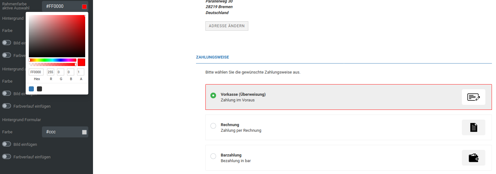 |
| Background | |
| Color | Background color of the list elements, except the active selection, pre-filled with transparent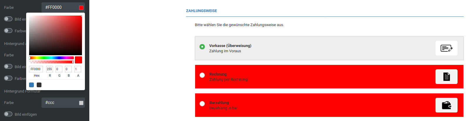 |
| Insert image | Background image of the list elements, except the active selection |
| Insert gradient | Color gradient as the background of the list elements, except the active selection |
| Background active selection | |
| Color | Background color of the currently selected list element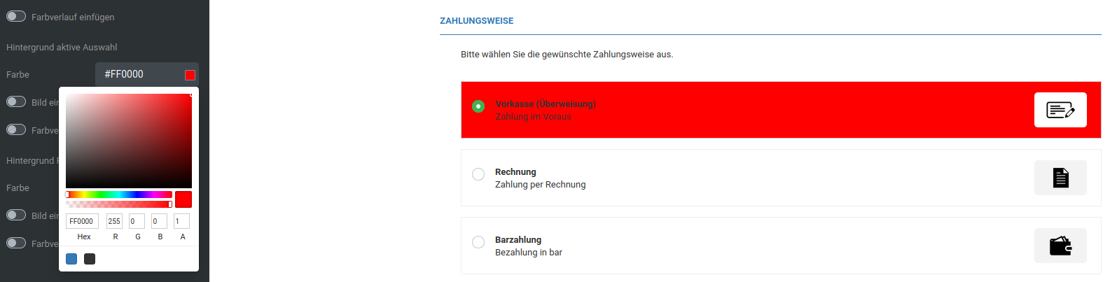 |
| Insert image | Background image of the currently selected list element |
| Insert gradient | Color gradient as the background of the currently selected list element |
| Background form | |
| Color | Background color of forms of the list entries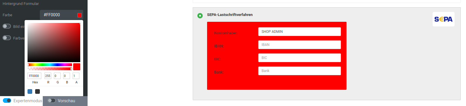 |
| Insert image | Background image of forms of the list entries |
| Insert gradient | Color gradient as the background of forms of the list entries |
Terms and conditions and withdrawal checkboxes
| Field name | Description |
|---|---|
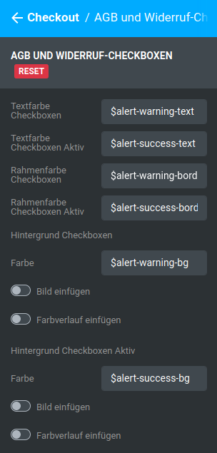
| Text color checkboxes | Text color of the checkbox description, except checked checkboxes, pre-filled with $alert-warning-text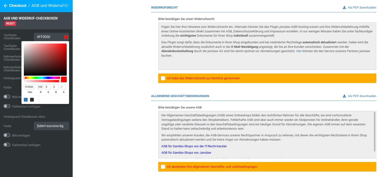 |
| Text color checkboxes active | Text color of the checkbox description of checked checkboxes, pre-filled with $alert-success-text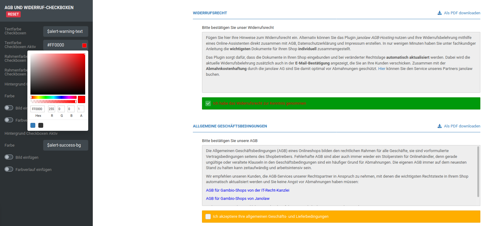 |
| Border color checkboxes | Border color of the block consisting of checkbox and description, except checked checkboxes, pre-filled with $alert-warning-border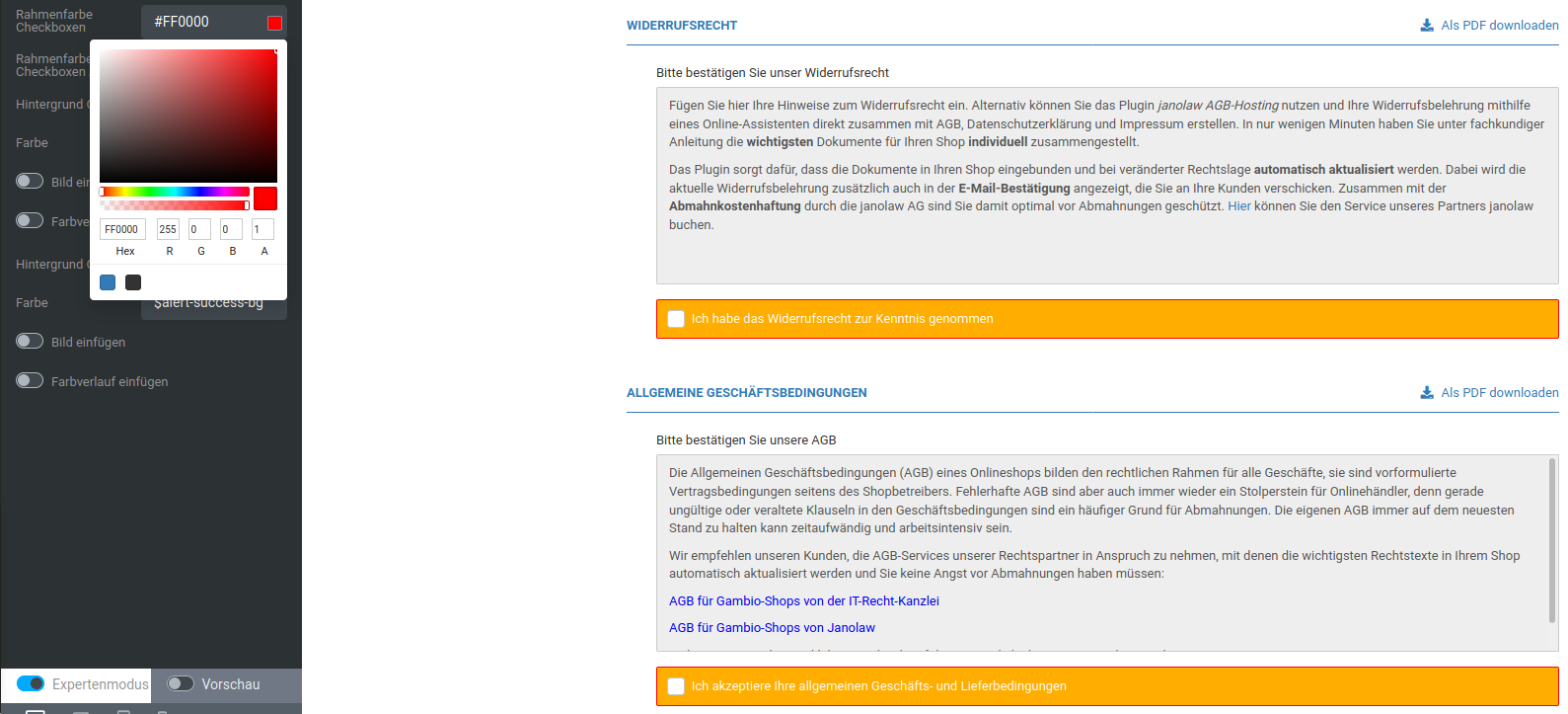 |
| Border color checkboxes active | Border color of the block consisting of checkbox and description for checked checkboxes, pre-filled with $alert-success-border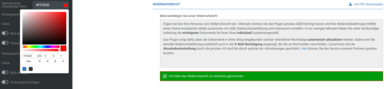 |
| Background checkboxes | |
| Color | Background color of the block consisting of checkbox and description, except checked checkboxes, pre-filled with $alert-warning-bg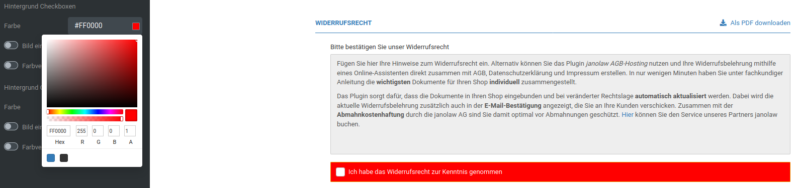 |
| Insert image | Background image of the block consisting of checkbox and description, except checked checkboxes |
| Insert gradient | Color gradient as the background of the block consisting of checkbox and description, except checked checkboxes |
| Background checkboxes active | |
| Color | Background color of the block consisting of checkbox and description for checked checkboxes, pre-filled with $alert-success-bg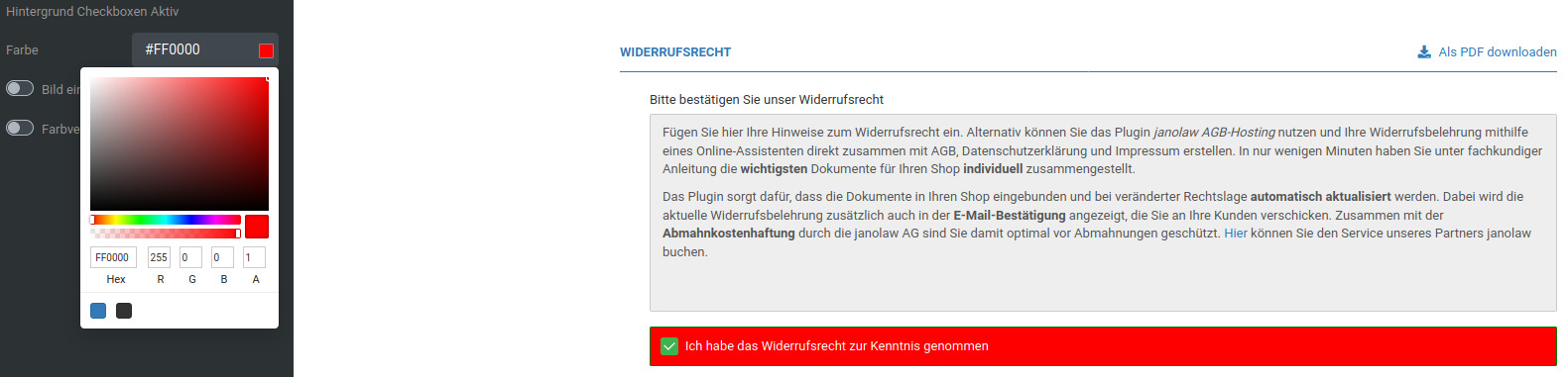 |
| Insert image | Background image of the block consisting of checkbox and description for checked checkboxes |
| Insert gradient | Color gradient as the background of the block consisting of checkbox and description for checked checkboxes |
Menu boxes
Header row
| Field name | Description |
|---|---|
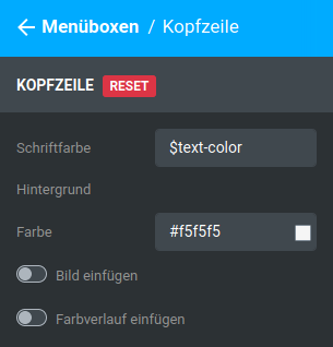
| Font color | Font color of the header row, pre-filled with $text-color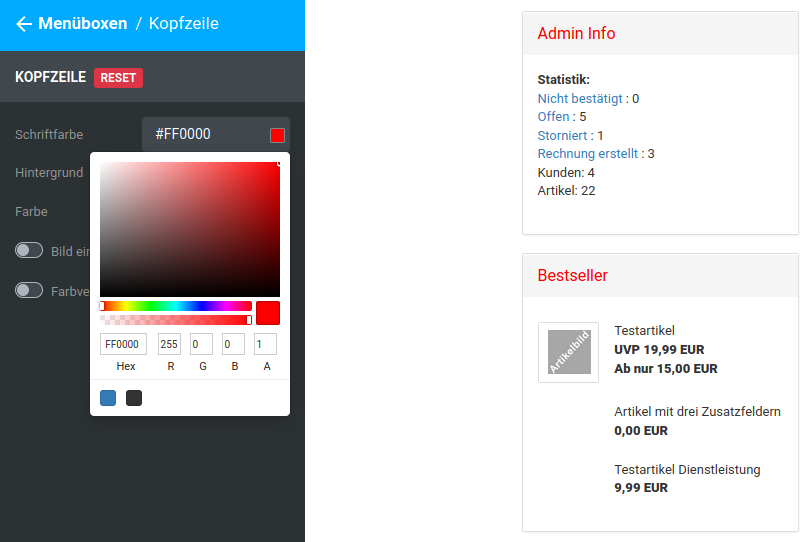 |
| Background | |
| Color | Background color of the header row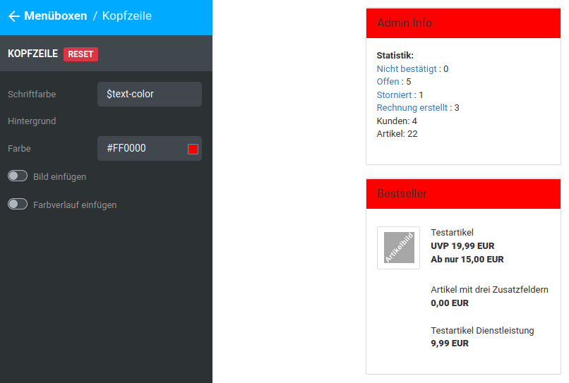 |
| Insert image | Background image of the header row |
| Insert gradient | Color gradient as the background of the header row |
Content area
| Field name | Description |
|---|---|
| Background | |
| Color | Background color of the content area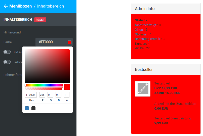 |
| Insert image | Background image of the content area |
| Insert gradient | Color gradient as the background of the content area |
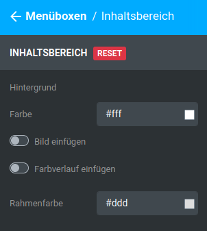
| Border color | Border color of the menu box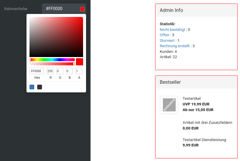 |
Pages with menu box column
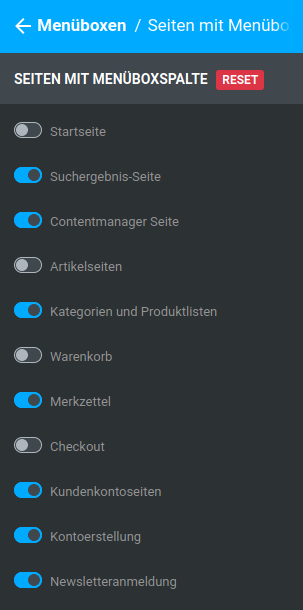
The display of the menu boxes can be switched on and off for the individual pages or page types of the shop. To do this, activate (switch blue) or deactivate (switch gray) the desired settings. The menu boxes can be activated in the Honeygrid for the following pages:
- Start page
- Search results page
- Content manager page
- Product pages
- Categories and product lists
- Shopping cart
- Wish list
- Checkout
- Customer account pages
- Account creation
- Newsletter subscription
Selection and positions
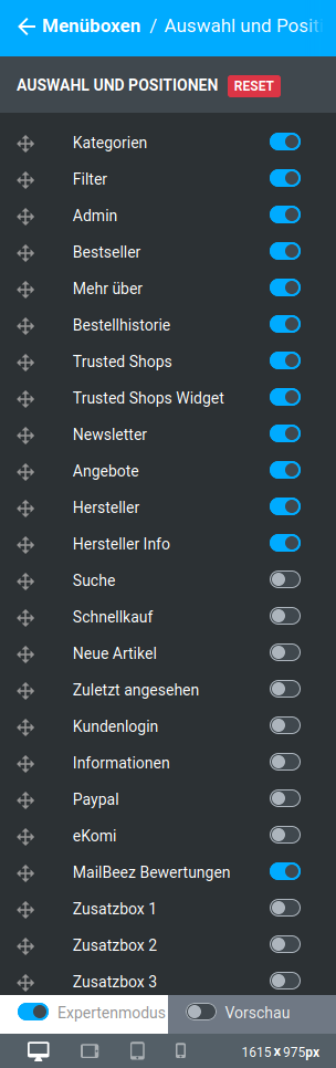
The menu boxes of the shop are listed in this area. By activating (switch blue) and deactivating (switch gray) the individual settings, you can switch the respective menu boxes in the shop on and off.
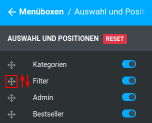
To change the order of the menu boxes, move the mouse pointer over the arrow-cross symbol to the left of the name of the box that you want to move to another position. Left-click on the symbol and hold down the mouse button. Now drag the entry up or down to change its order. Release the mouse button when it is in the desired position.
Cookie Consent Panel
General
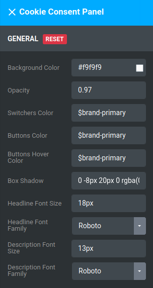
| Field name | Description |
|---|---|
| Background Color | Background color of the cookie consent panel and cookie settings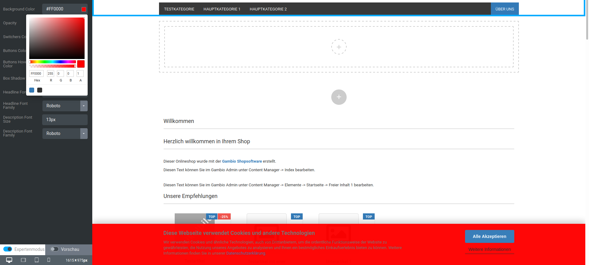 |
| Opacity | Opacity, how strongly should the area behind the panel shine through? |
| Switchers Color | Currently no function, will be removed in the upcoming version |
| Buttons Color | Background color of the switches and buttons, pre-filled with $brand-primary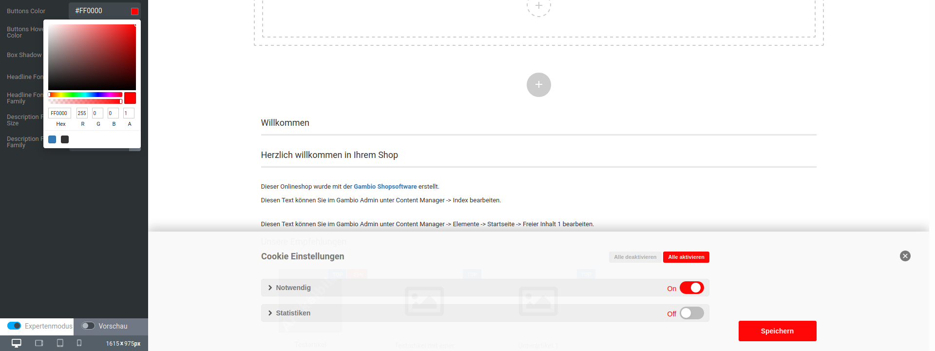 |
| Buttons Hover Color | Hover background color of the buttons, pre-filled with $brand-primary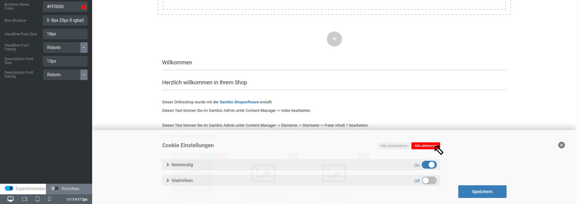 |
| Box Shadow | Shadow gradient of the panel, pre-filled with 0 -8px 20px 0 rgba(0,0,0,.2) |
Note
This row uses CSS code as input. You can find examples and explanations, for example, on the selfhtml pages:
https://wiki.selfhtml.org/wiki/CSS/Eigenschaften/%C3%A4u%C3%9Fere_Gestaltung/box-shadow
https://wiki.selfhtml.org/wiki/Referenz:CSS/Eigenschaften/box-shadow
| Field name | Description |
|---|---|
| Headline Font Size | Font size of the headline |
| Headline Font Family | Font of the headline |
| Description Font Size | Font size of the description text of the cookie consent panel |
| Description Font Family | Font of the description text of the cookie consent panel |
Note
Hovering or mouseover refers to placing the mouse pointer over an element without clicking on it
Widgets
Widgets are freely placeable content in designated areas. The following widgets currently exist:
Text
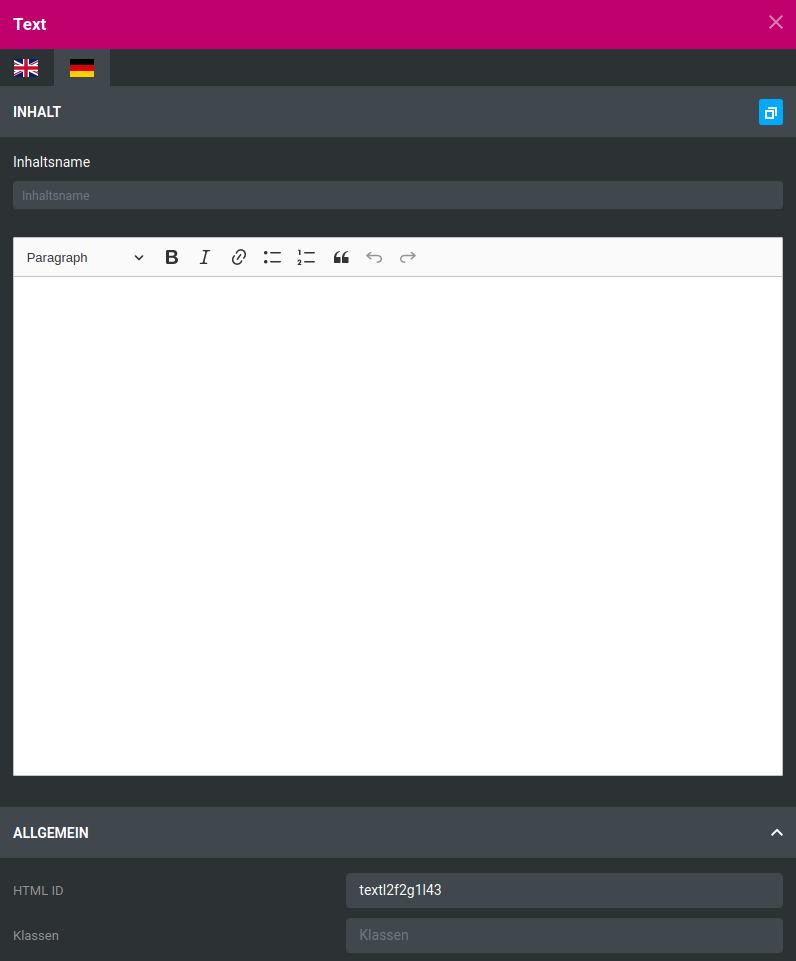
Text widgets allow the placing of texts. The respective language can be selected via the flag symbols; the blue button at the top right allows the currently displayed text to be copied into the input fields for the other languages.
The Content name defines the name of the respective text; it is also used in the Content Manager.
From left to right, the following settings are available in the editor:
- Paragraph/Heading: defines whether the currently selected line(s) is or are a paragraph (Paragraph) or a heading of first to third order (Heading 1 to Heading 3).
Note
A single line can be selected by placing the cursor. Multiple lines by highlighting the text passages. Whole lines are always selected here.
- Bold
- Italic
- Link (an input window for the link address is displayed)
Note
The settings Bold, Italic and _Link _only affect highlighted text passages.
- Unordered List (define selected line(s) as a list with bullet points)
- Ordered List (define selected line(s) as a list with Arabic numerals)
- Block Quote (define selected line(s) as a quotation)
- Undo (undo the last step)
- Redo (carry out the last undone step again)
The HTML ID is output below the editor. It is used for the unique identification of the content within the HTML code. Changes are optional. Via the field Classes, the element receives a so-called class at HTML level. For multiple elements with the same class, custom style settings can be made, e.g. via CSS code. Its use is optional.
Image
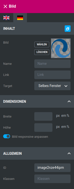
| Field name | Description |
|---|---|
| Image | Selection of the image file |
| Name | Name of the image |
| Link | Link to be called up when the image is clicked |
| Target | Where should the link be opened? |
| Field name | Description |
|---|---|
| Width | Width of the image in the set unit |
| Height | Height of the image in the set unit |
| Adjust image responsively | should the image be displayed responsively? |