Teaser slider
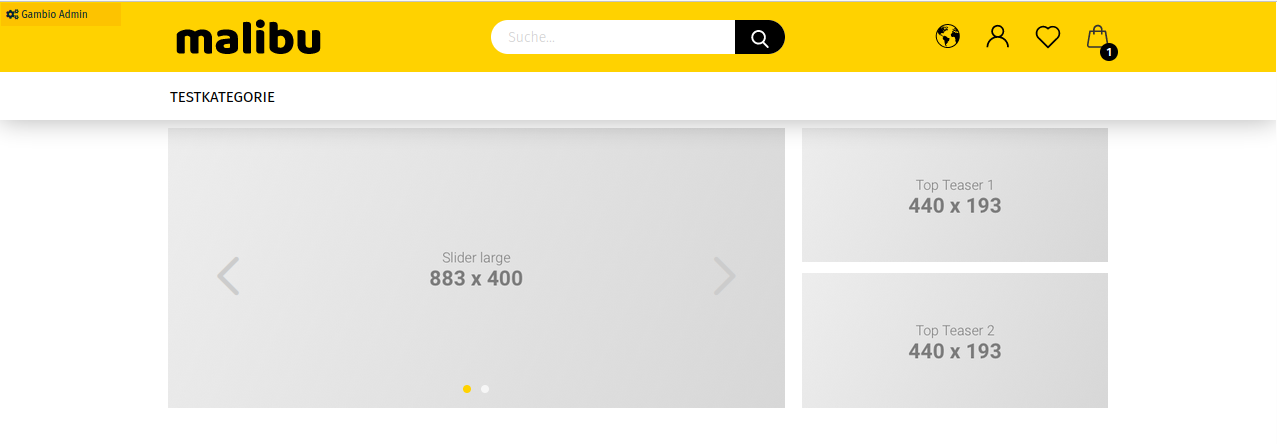
A teaser slider is an image presentation that is displayed in the storefront above the page content. You can individually include teaser sliders on the start page and on content pages as well as on category pages and product details pages.
Managing teaser sliders
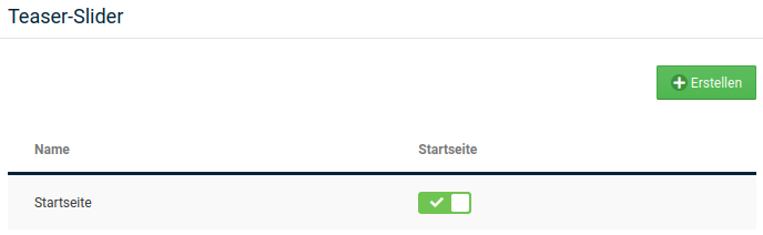
You can create new teaser sliders in the Gambio Admin of your shop under Content > Teaser slider.
Note
In the teaser slider, preview images of the images contained in the slider can be displayed in the lower right corner of the slider. The preview images (thumbnails) are not created by the shop system and must be reduced to the desired size with a suitable graphics program before uploading.
Creating a slider
- Click on Create
- Enter a name for the new slider under Name
- If necessary, change the display duration per image in seconds in the Speed field
- Click on Save to save the configuration of the teaser slider
Deleting a slider
- Move the mouse pointer into the row of the slider you want to delete
- Click on the trash can icon
- Confirm the confirmation prompt by clicking on Delete to delete the selected teaser slider
Adding images
A so-called slide is created for each image of the teaser slider. A slide corresponds to one image, but a separate image file can be assigned for each of the different views of the shop. In this way, images with resolutions adapted for this purpose can be used for different views (e.g. desktop view or smartphone view). A slide has its own settings page for each individual language used in the shop, which can be selected via the tab with the country flag at the top left.
To set up an image file for a specific use case, move the mouse pointer into the row with the corresponding dropdown menu and then click on the upload icon. After uploading, the image file is available in the corresponding dropdown.
| Field name | Description |
|---|---|
| Preview image | image file that is used as a thumbnail |
| Smartphone | image file for the smartphone view |
| Tablet Portrait | image file for the tablet view (portrait) |
| Tablet Landscape | image file for the tablet view (landscape) |
| Desktop | image file for the desktop view |
| Title | the image title of the current slide (is displayed in the storefront when hovering over it with the mouse) |
| ALT text | the alternative text of the current slide (is displayed if the image cannot be loaded) |
| Link | determines whether the specified website is opened in a new window or in the same window |
| if specified, the customer is redirected to the specified website when clicking on the slider (is ignored if the image map is configured) |
A slide can be deleted by clicking on the trash can icon in the gray title bar of the slide. With the - or + a slide can be minimized or restored.
Assigning teaser sliders
You can assign teaser sliders to one or more categories, products and content pages as well as to the start page.
Setting the start page slider
You can set the start page slider in the Gambio Admin of your shop under Content > Teaser slider. To do this, set the checkmark for the desired teaser slider in the Start page column.
Setting the content slider
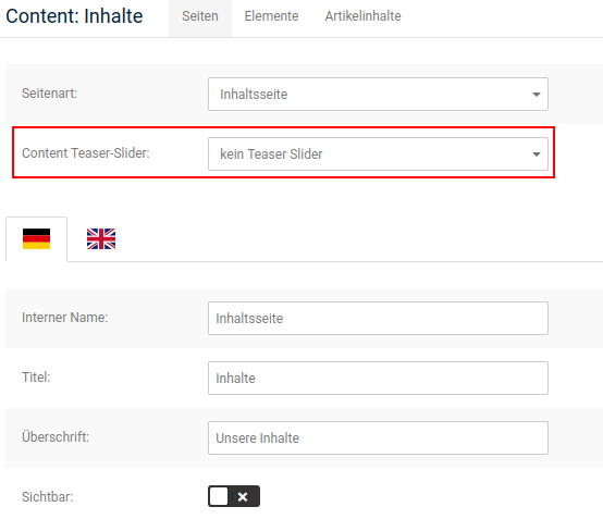
You can set the teaser slider for a content in the Gambio Admin under Content > Content Manager.
- Click on the pencil icon (edit) of the content for which you want to assign a slider
- Select the teaser slider for this content from the Content teaser slider list
- Click on Save or Update at the end of the entry form to assign the teaser slider to the content
Setting the category slider
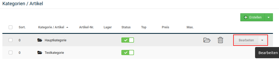
You can set the teaser slider for a category in the Gambio Admin under Products > Products/Categories.
- Select the desired category from the list
- Click on Edit in the dropdown button
- Select the teaser slider for this category from the Category teaser slider list
- Click on Save to the right of the Category teaser slider list to assign the teaser slider to the category
Setting the product slider
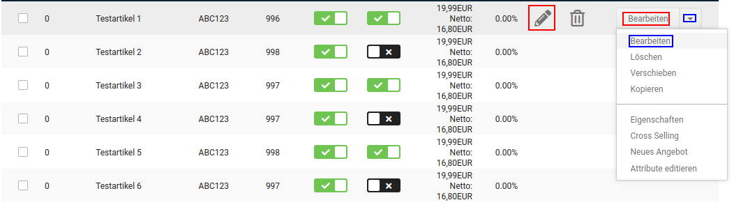
You can set the teaser slider for a product in the Gambio Admin under Products > Products/Categories.
- Select the desired product from the list
- Click either on the pencil icon or on Edit via the dropdown button
- Select the teaser slider for the details page of this product from the Product teaser slider list
- Click on Save or Update at the end of the page to assign the teaser slider to the product
Link area (image map)
A so-called image map can be assigned to each image in the teaser slider (except preview images). This allows individual areas of an image to be defined as links and provided with references to other pages. In this way, e.g. several products can be linked directly in one image.
First go to Content > Teaser slider and edit the desired slider. Scroll to the respective slide and move the mouse pointer into the row of the image (e.g. image for desktop) for which an image map is to be created. Click on the image map icon here:

A new window opens, in the lower part of which the image is displayed. In the upper part, the following settings are displayed in sequence:
- Link area: the individual link areas can be selected via the dropdown
- Link area title: the name of the link area can be assigned via this field
- Link area URL: target of the link
- Link area target: whether the link is to be opened in the same window/tab or in a new window/tab
Creating a new link area
With the Create new link area button, a part of the image can be selected and linked. To do this, assign a link area title and insert the address under link area URL that is to be called up when clicking in the link area.
Note
If the page is outside the shop, the link must be specified with http:// or https://. For pages within the shop, the specification after the shop address is sufficient. If, for example, a link is to be made to the category Test with the URL https://www.beispiel.de/test, the specification /test is sufficient for the link area URL.
Also select via Link area target whether the linked page is to be opened in the same tab/window (depending on the browser setting).
Note
For pages that are outside the shop, the setting Open in new window is recommended, so that the customer has the shop page open in parallel. For pages within the shop, open in same window can be used.
The link area can be defined with the mouse in the lower part of the window. To do this, click in the image with the left mouse button to set a corner point. The area can be defined via three or more corner points. A point can be moved by pressing and dragging with the left mouse button. To delete a point, click on it with the right mouse button.
Confirm the defined link area by clicking on Apply. If you want to discard the settings, click on Cancel.
Editing an existing link area
To edit a link area, it can be selected via the Link area dropdown. All settings that were made when creating the link area can be changed.
Confirm the changes by clicking on Apply. Clicking on Cancel ends the editing without saving the changes.
Deleting a link area
To delete a link area, select it via the Link area dropdown and click on Delete.
Attention
There is no confirmation prompt; the link area is irrevocably deleted.